Brand identity & strategy for Crest Experiences

Creating a bold brand strategy and identity for a new leader in active leisure destinations.

Crest Experiences launched with an ambitious goal: to bring a world-class inland surfpark to London while building a long-term consultancy brand in the active leisure sector. We partnered with the team to define their brand strategy, shape their positioning and create a distinctive visual and verbal identity rooted in expertise, wellbeing and community impact.

Services Delivered

  • Brand identity
  • Brand strategy
  • Design
  • Guidelines
Crest Experiences Logo

Results

  • Established a clear break from legacy surf park brand associations.
  • Achieved immediate recognition and adoption of the new name at global surf park conventions.
  • Enabled clear differentiation from Surf London for investors, directly supporting successful fundraising.

At a time where we needed to achieve brand clarity at pace, Future Kings delivered a brilliantly collaborative and fast moving process. This enabled us to launch Crest Experiences with great confidence, and the brand has immediately had authoritative positioning in the market."

Joseph Dale - Head of Commercial
Crest Experiences Logo with a man surfing

The Challenge

Following the sale of The Wave in June 2025, Crest Experiences brought a new identity and new future for a leadership team of seasoned experts in the active leisure destination category. They had an ambitious and focused goal: to secure funding for an inland surfpark in London. Utilising a 100 acre site in the Lee Valley, the team were working to create a space for people to enjoy unforgettable experiences, build communities and boost wellbeing.

The team wanted our expertise to help them develop a brand strategy, design identity and a set of messages that could engage with their diverse audiences – from members of the public to investors, from local councils to hardcore surfers. The brand also needed to live beyond this key project, however. The team saw an opportunity to use their experience of designing, creating and operating inland surf destinations to offer consultancy services across the active leisure market. 

Crest Experiences Logo

Our Approach

We held a What? Why? How? discovery session with the team to understand their goals as a company, their customers and the competitor set. One thing that we identified as a strategic advantage in the emerging surf and active leisure category was the team’s experience of running a successful inland surf destination for over six years. It was a depth of knowledge, hard-won expertise and insightful understanding that the competitors simply didn’t have.

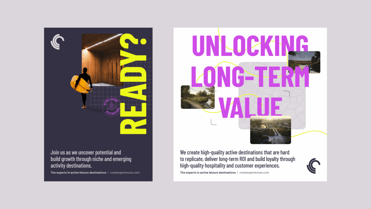
We also identified the importance of the benefits that Crest Experiences offers. Wellbeing, connection  through community and unforgettable experiences are powerful messages that speak directly to every target audience. Another element we needed to highlight was the team’s focus on delivering long-term value – the commercial benefits for local people, businesses and communities.

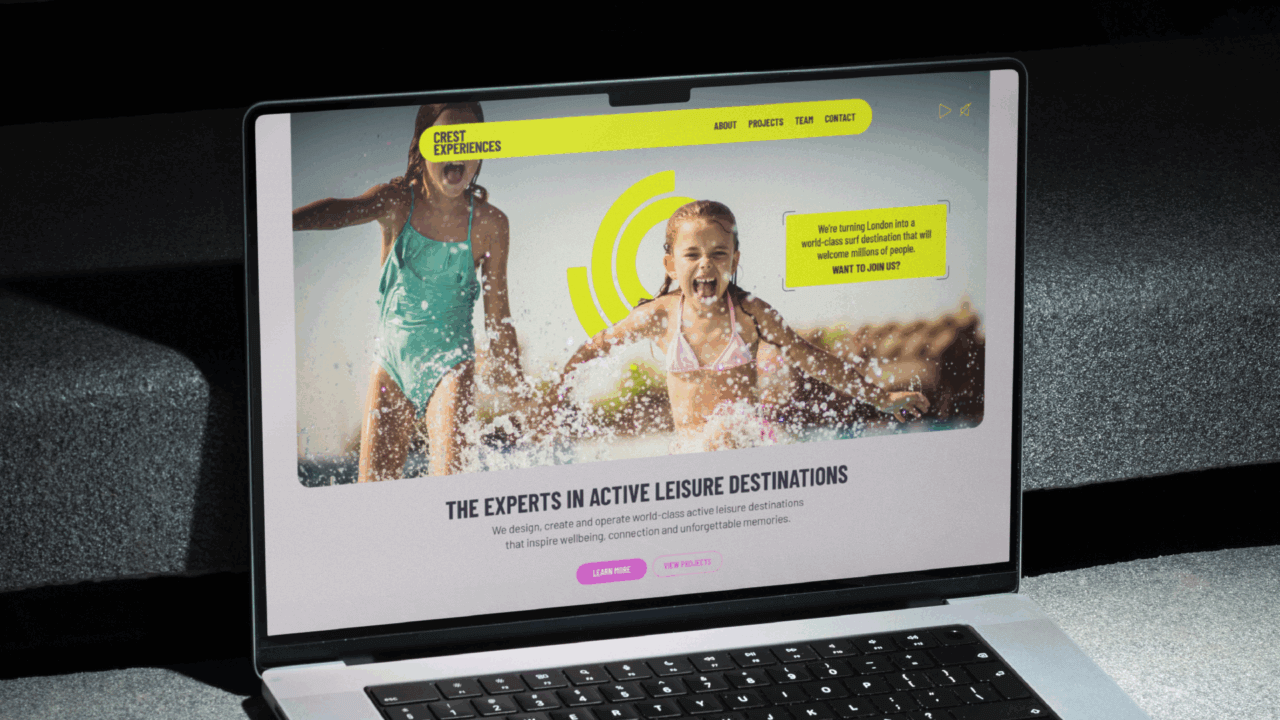
The strategy we created therefore leant heavily into the team’s experience and expertise. As a new business speaking firstly and foremost to professional/B2B audiences, we also felt that a functional, rational and very clear proposition to market was key. A simple, functional tagline delivers immediate understanding of exactly what Crest Experiences offers: Experts in active leisure destinations.

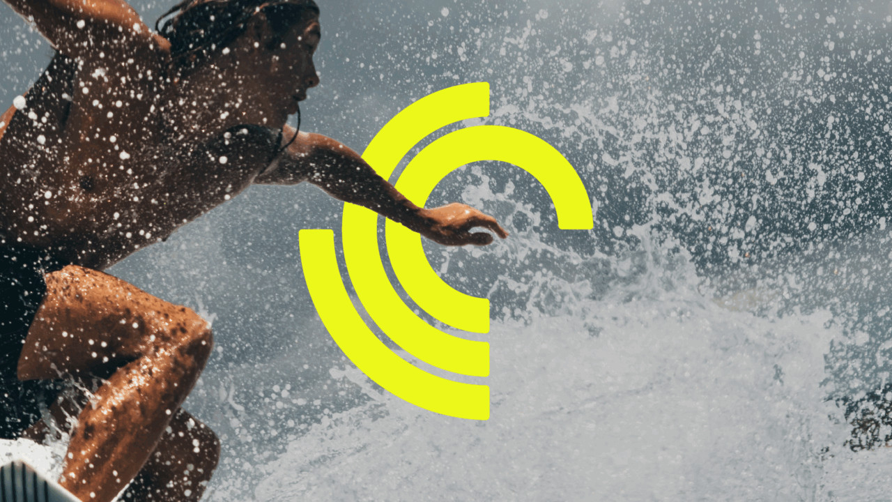
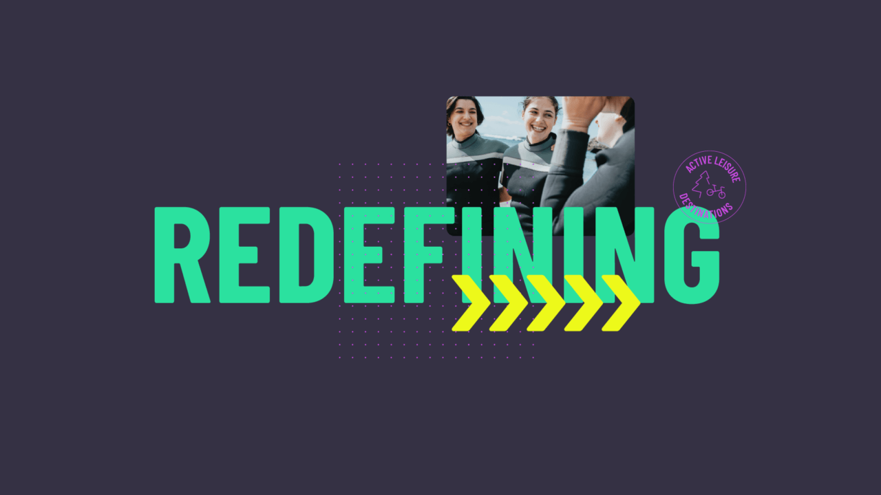
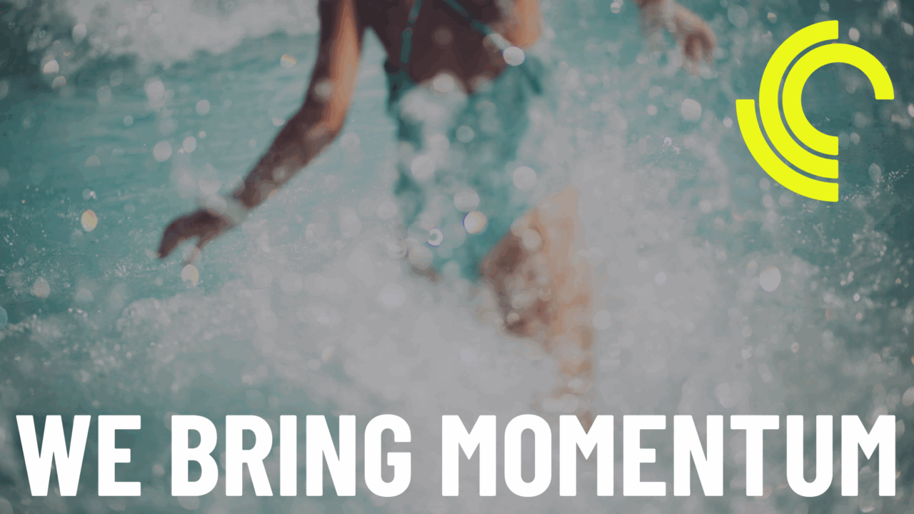
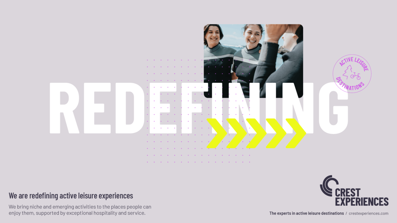
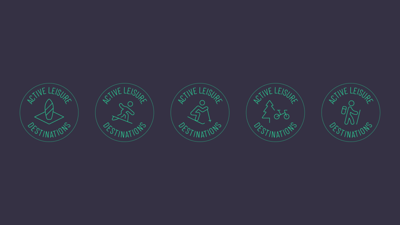
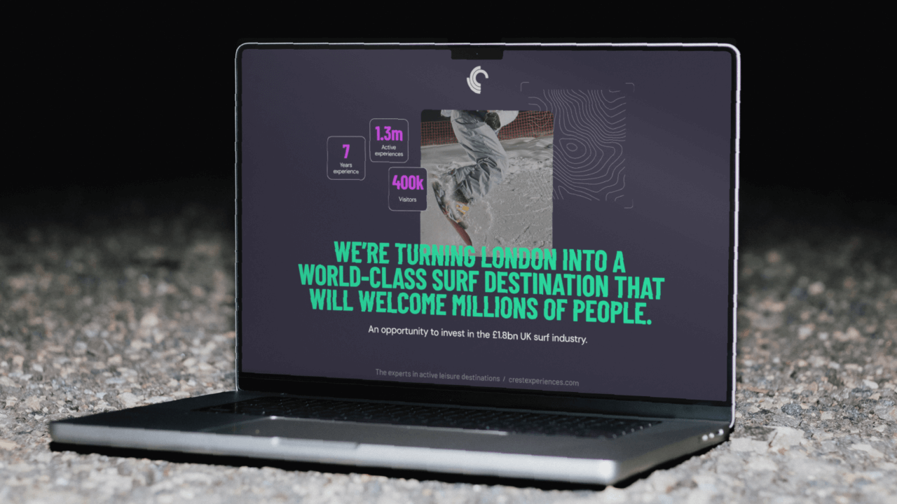
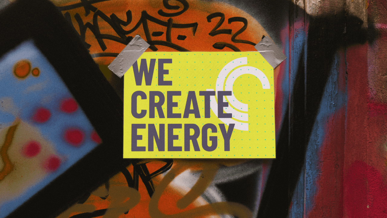
With a strategic platform in place, defining the market positioning, customer proposition and key message themes, we began our visual design process. This was about balancing two key concepts: firstly, representing the team’s expertise and experience; secondly, about delivering and profitably running active leisure destinations. Collages offered a way to bring different elements of an expansive project together, from start to finish. Each collage features evocative photography, graphic symbols, grids and icons to tell a visual story and show depth of expertise.

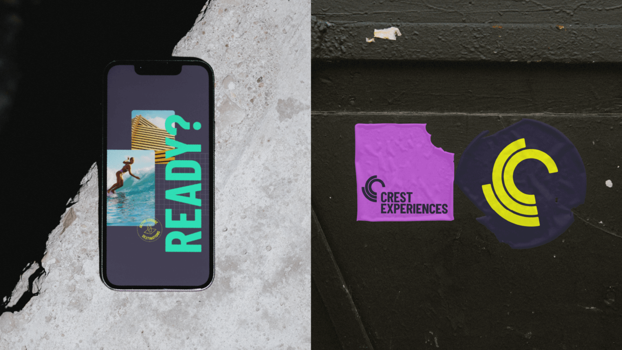
Bold, single word headlines were woven through the graphics to add context and bring a powerful typographic punch to the visual system. Colour was another key part of the visual toolkit. We used simple base tones of grey and navy to ground the identity and complemented them with hits of bright accent colours to bring energy to the design system.

The overall brand delivered a flexible, dynamic and engaging brand. It delivers exactly what Crest Experiences need it to today, but is ready to scale and flex as the business grows and diversifies in the future.

This was a fantastic opportunity for us to develop a completely fresh brand by working closely with a highly ambitious and experienced team. We were able to move at real pace, delivering exactly what the team needed, exactly when they needed it to help them secure the funding they needed to progress.”

Tom Crawshaw, – Design Director, FutureKings