Crest Experiences
Brand identity & strategy for Crest Experiences
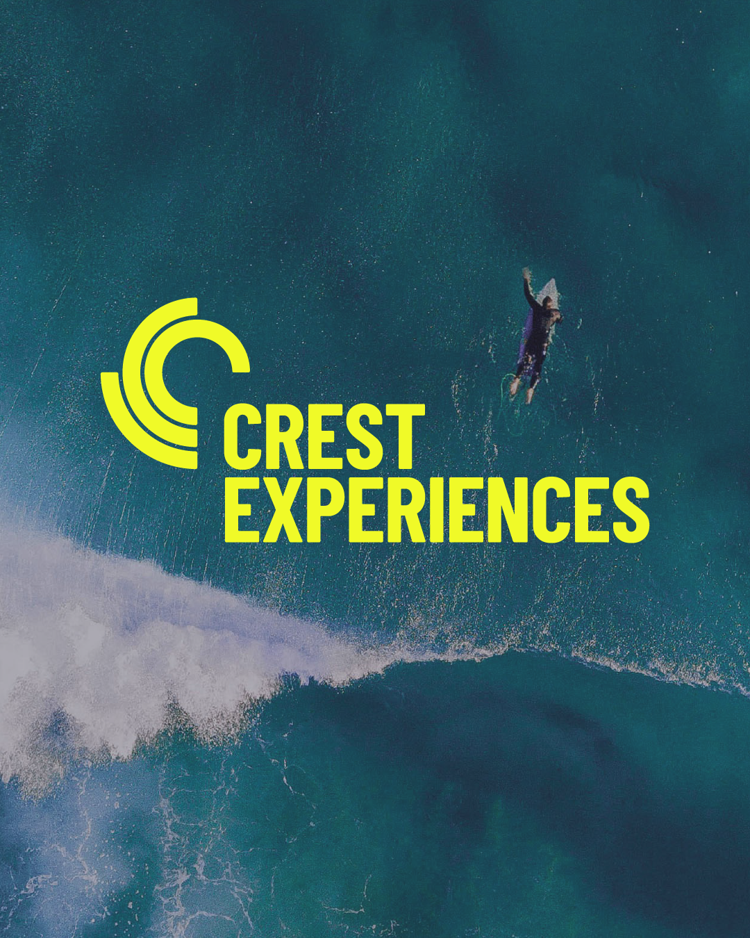
Positioning Crest Experiences as experts in active leisure destinations and supporting their inland surf park vision.
Brand identity Brand strategy Design Guidelines
Big news — we're now in Amsterdam!
Find out more here.Secured a prestigious distribution partner
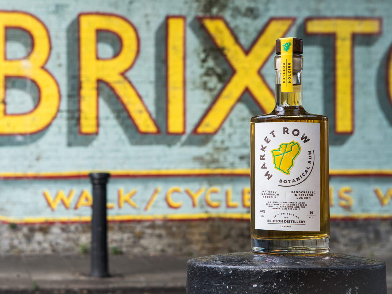
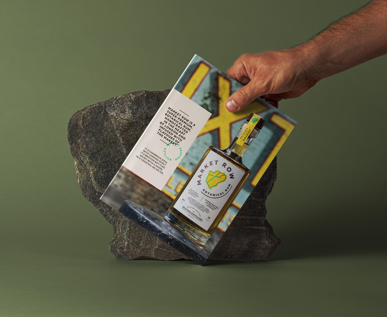
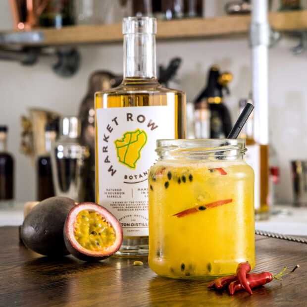
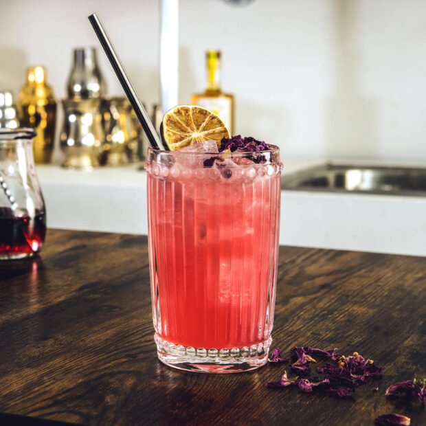
Market Row is a straight-talking, forward-thinking, urban rum made in the heart of Brixton. They needed a brand to bring their vision to life, balancing Caribbean roots with the urban edge of a South London distillery. It had to be loud and proud, old and new, premium but with plenty of grit. Brixton market held the key. This rum took everything that made the local area great – the diversity, the vibrancy, the community spirit – and bottled it.
Secured a prestigious distribution partner
Successfully secured next stage funding
Market Row simply wouldn’t exist without the partnership we’ve formed with FutureKings. We worked symbiotically to develop the Product and the Brand at the same time, evolving the ingredients as the brand story changed, and visa versa.
Our job was to develop a brand identity that balanced the Caribbean roots of the rum with the urban edge of a South London distillery. It had to be loud and proud, old and new, premium but with plenty of Brixton grit. We set out to create a compelling brand story that would help the founders’ bring their concept to life and support them to secure investment.
Reviewing the market, provenance is a significant selling point in rum and provides a quality cue for competitor brands. We knew, as a premium brand, we wanted to reflect the Caribbean heritage of their base liquid, while also moving away from traditional rum branding for shelf standout and differentiation. Brixton market held the key.
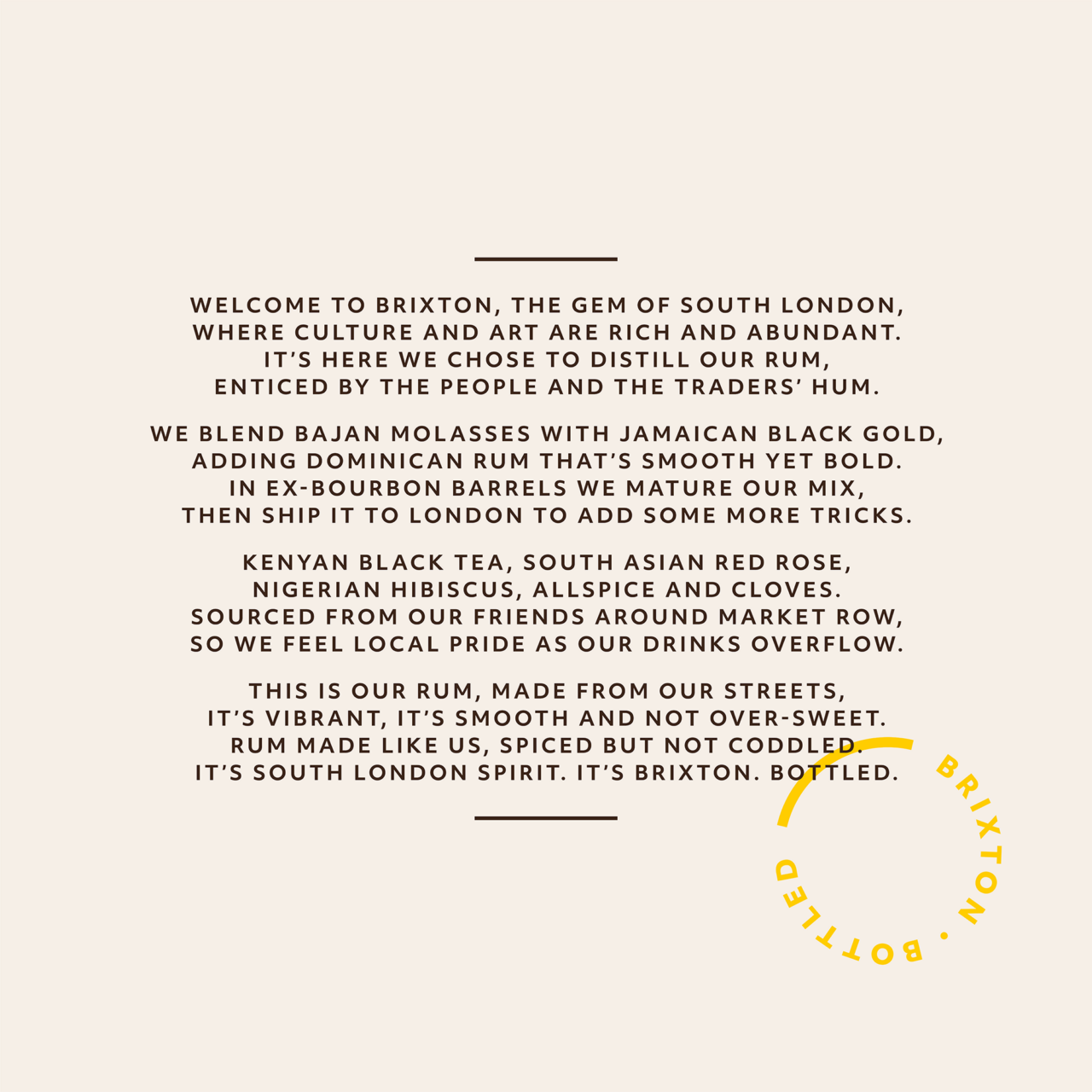
By sourcing botanicals from in and around Brixton market, this rum took everything that made the local area great – the diversity, the vibrancy, the community spirit – and bottled it. It was Brixton. Bottled. We used this as a guiding principle for building the brand.
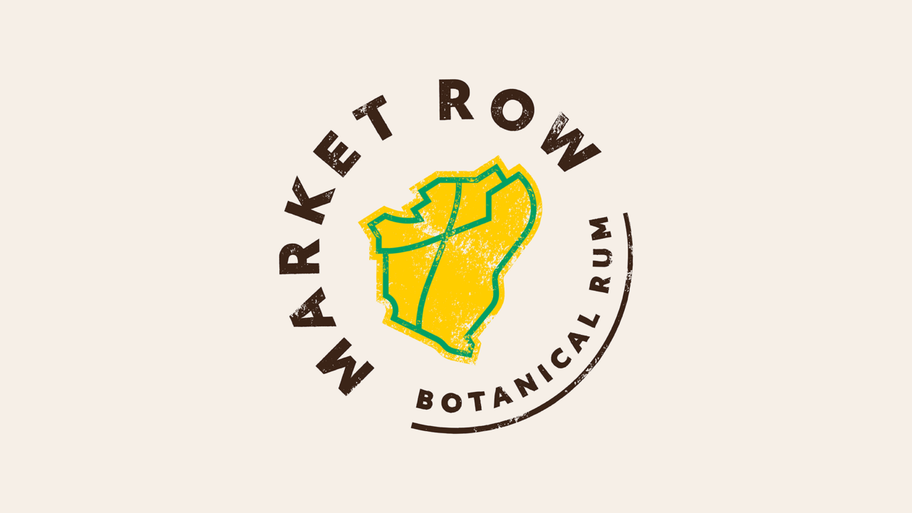
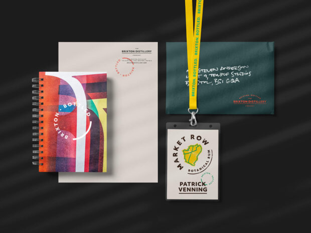
After getting to know the business and Brixton, we generated a longlist of names internally, inspired by local figures, wildlife, bus numbers and more. Market Row was the perfect choice, taking its name from the road in Brixton where many of the botanical ingredients are sourced and where the distillery is now based. The name situates the business and the brand in the heart of the community, and emphasises that it’s a no fuss brand that pushes the premium rum category forward, offering up an edgier, more inclusive alternative to mass-market rums.
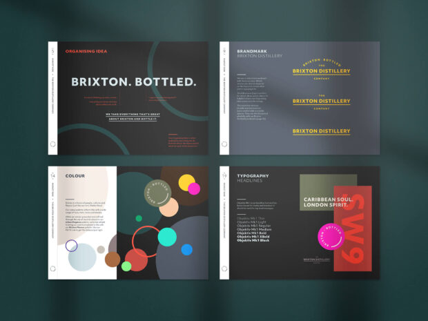
Guided by the design principle of ‘urban elegance’, we built Market Row to stand out next to mass-market brands. Where they use traditional typography, we use bold imperfect type; where they use dull product descriptions, we use lyrical verses; where they use dark, moody colours, we use a vibrant palette that celebrates the Caribbean soul of Brixton. To make the packaging more unique, we chose an angular bottle to literally give it an edge, and for the brandmark, we took inspiration from the map outline of the Borough as it’s reminiscent of an island, cleverly balancing the Caribbean heritage with urban Brixton grit.
Along the way, we also worked with Market Row’s founders to define their Brand Building Blocks, helping them articulate and live out their principles of being inclusive, passionate and grounded in everything they do.
It’s always exciting to work with a startup, but Market Row offered us an opportunity to develop our ideas along with the actual product, making the creative process more iterative. We believe the team are now well placed to take advantage of the rise in premium rums, and we’re thrilled to have been a part of their journey.
Ben Mott
Founder & Managing Director, FutureKings
Positioning Crest Experiences as experts in active leisure destinations and supporting their inland surf park vision.
Brand identity Brand strategy Design Guidelines

A complete brand refresh, from logo to packaging & website, with a supporting launch campaign to grow sales and boost brand standout.
Brand identity Brand strategy Campaigns Design Guidelines Packaging UI UX Websites & Apps

Launched in May 2024, Newt Natural Capital has a unique, multi-disciplinary and expert approach to assessing, advising on and bringing integrity to the best Natural Capital Investments.
Brand identity Brand strategy Guidelines UI UX Websites & Apps