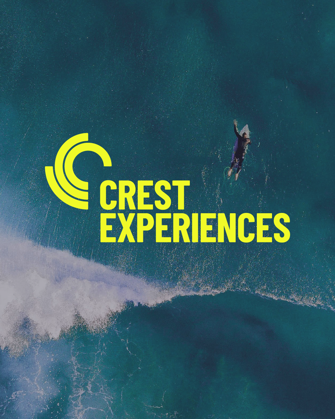
Crest Experiences
Brand identity & strategy for Crest Experiences
Positioning Crest Experiances as experts in active leisure destinations and supporting their inland surfpark vision.
Brand identity Brand strategy Design Guidelines
Big news — we're now in Amsterdam!
Find out more here.Bringing global consistency, retaining local expertise
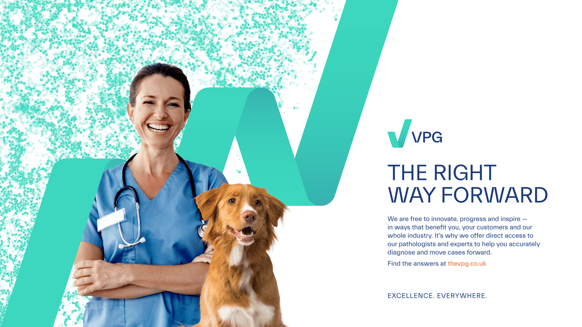
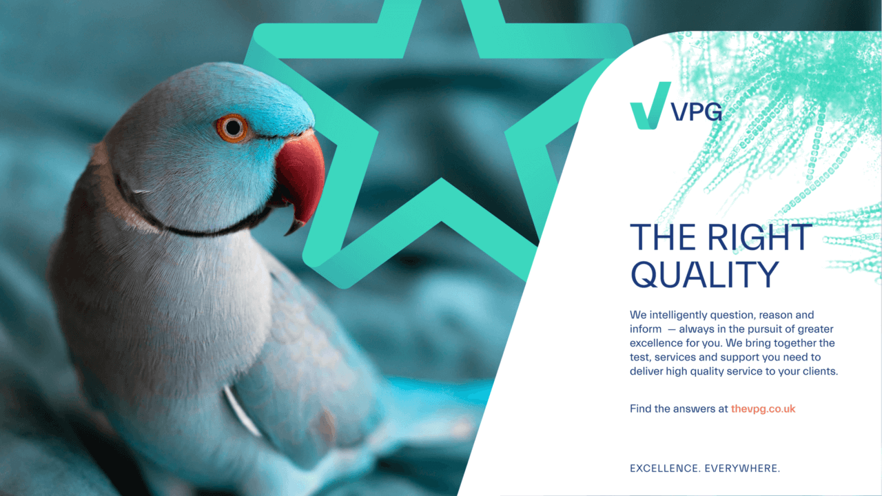
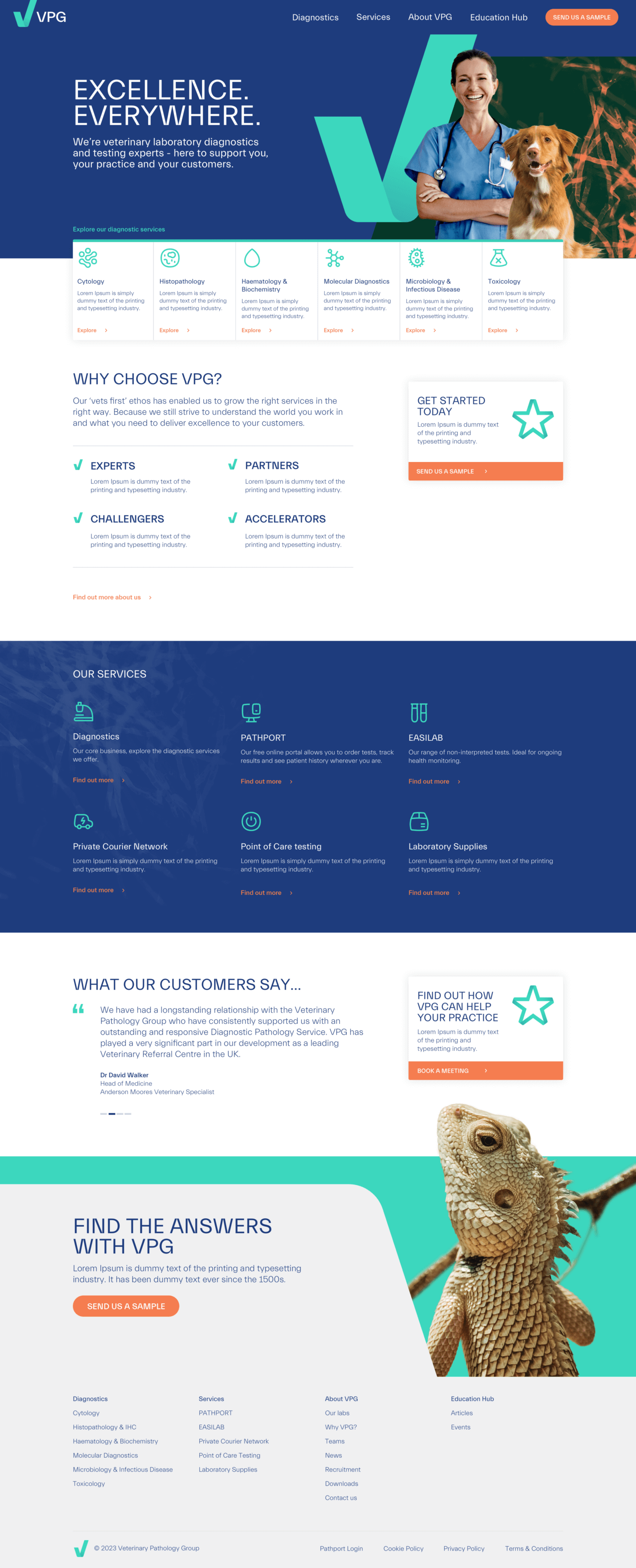
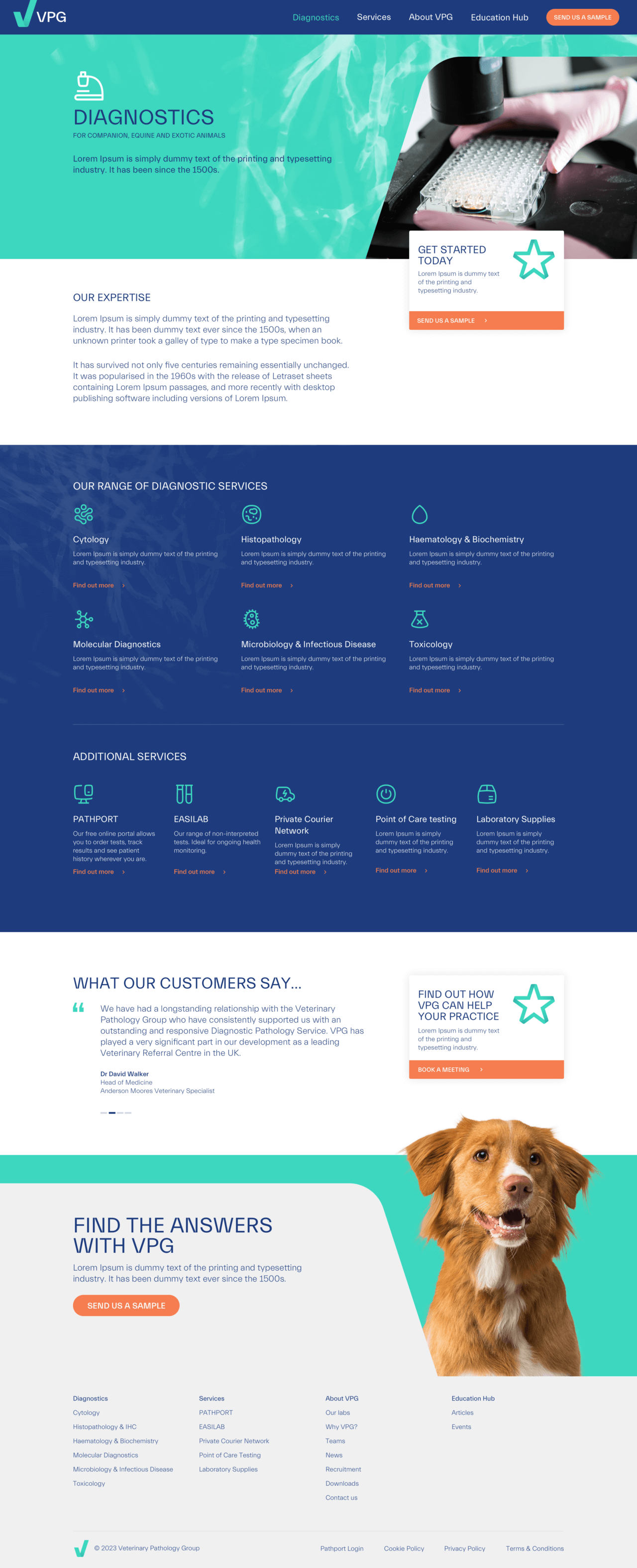
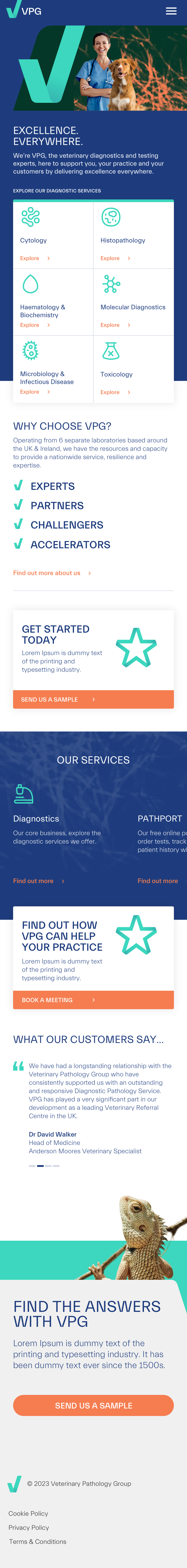
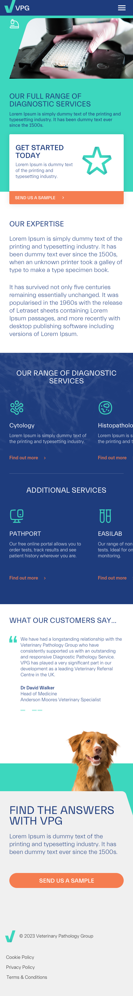
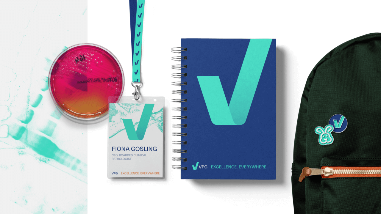
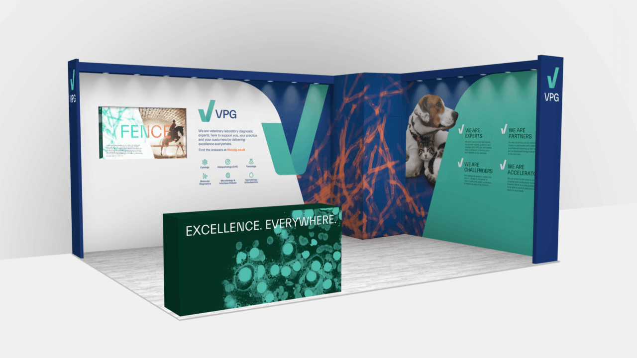
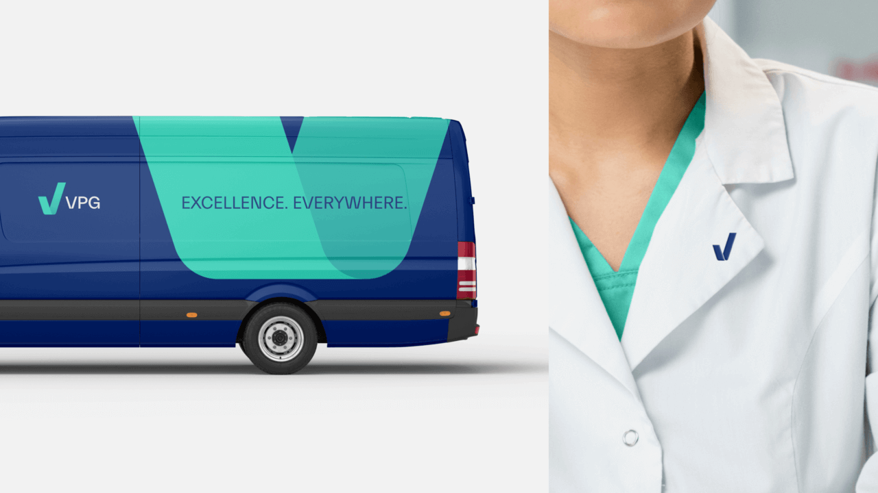
VPG (Veterinary Pathology Group) is a UK-based testing and pathology service used by veterinary practices to diagnose animals. Our brand challenge was to unite disparate business elements, prepare for global growth and tackle an increasing threat from international competitors. By delivering consistency we were able to make VPG’s brand stand out from the crowd and communicate the expert, human experience they deliver through our Organising Idea: ‘Excellence. Everywhere.’
Our challenge was to unite the different parts of the business, prepare the brand for global growth and tackle the growing threat from international competitors.
We worked closely with the VPG team to build an understanding of their business, products and services, team and culture. Competitors featured heavily in our initial discussions as two global players had recently rebranded and introduced new offers. We also explored customer personas to build an understanding of the behaviours and needs of VPG’s target audience.
Another key stage of our strategy work focused on the customer journey and establishing the key moments of interaction with the VPG brand. This was key as the online testing portal, and the interactions around this, were key elements of the user journey.
Through our strategic process we learned that what customers truly valued about VPG was the willingness of their team to speak directly to vets, helping them to reach conclusions and make accurate diagnosis based on the test results. No matter who you speak to, and whichever part of the business you engage with, in whatever location, VPG always delivered the highest quality in a personal way. It was the antithesis of the large, faceless competitors. And from this insight, we developed our brand platform of ‘Excellence. Everywhere.’
With our strategic platform in place, we used our creative Step? Jump? Leap? workshop to test different visual and verbal identity approaches. This helped us to understand which brand assets resonated with the target audience, helped make VPG distinctive from the competition and complemented their long-term strategic goals.
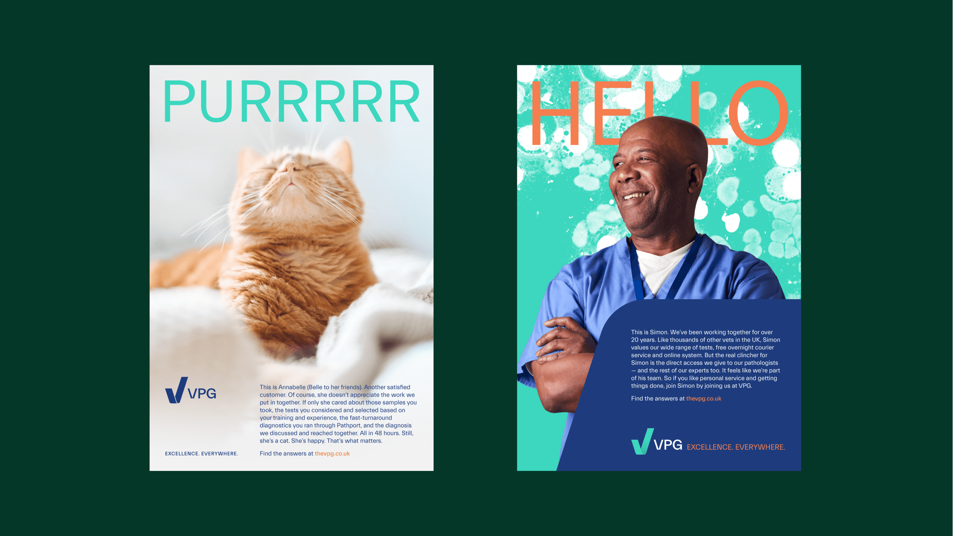
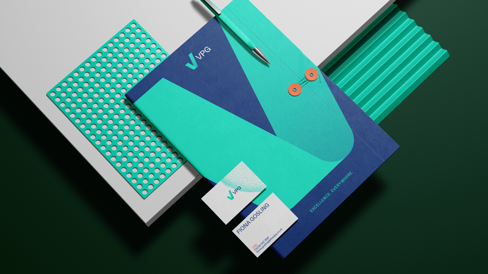
The final creative uses a distinctive ‘ribbon’ to form shapes associated with excellence — a tick, a star, a symbol of progress… A dark navy primary palette with an accent of teal helped to stand out from the competitors, and carefully chosen photography showcased the scientific excellence and human approach running through everything VPG does.
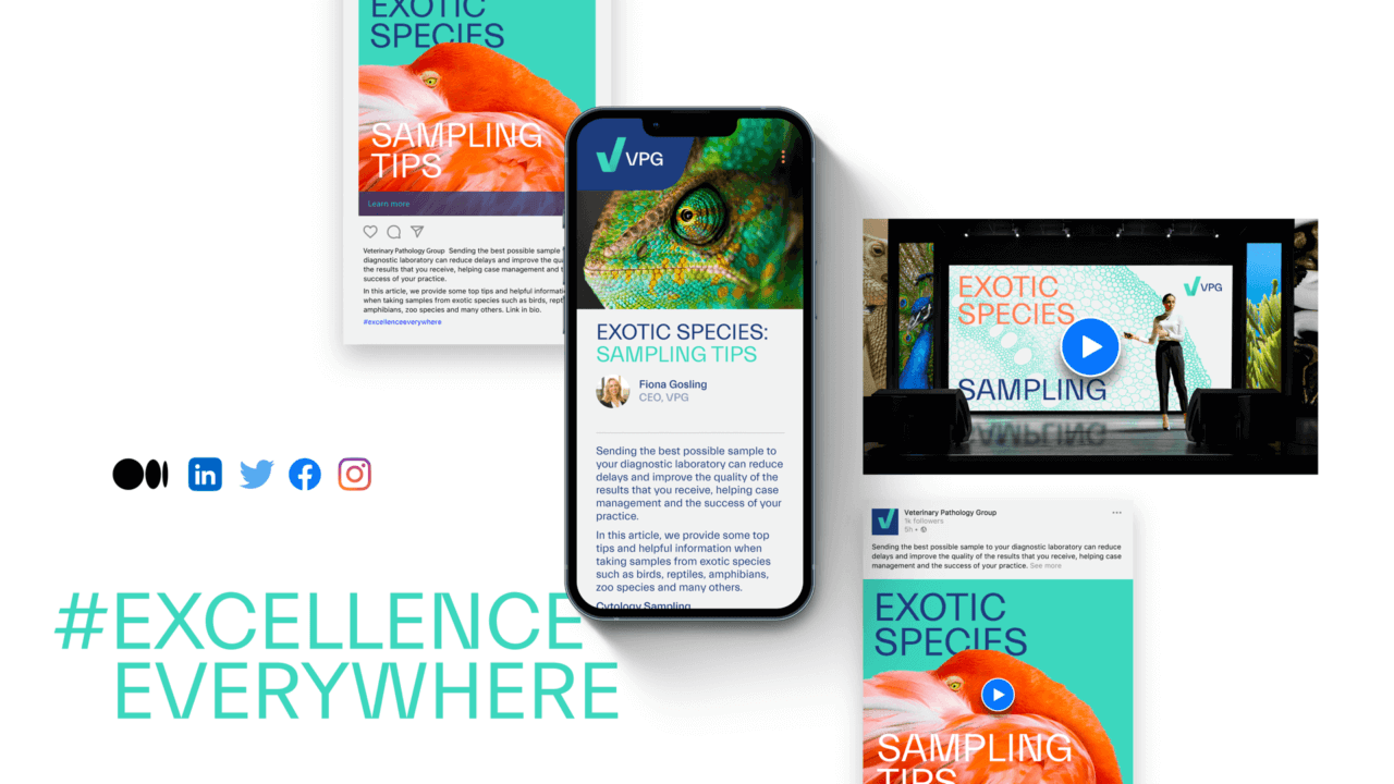
We developed two copy styles. At the primary level we use bold, single word headlines to create intrigue which lead into longer-form storytelling to convey levels of warmth, humour and confidence that’s unique in the category. At a secondary level, we use more benefit-led copy to help customers quickly and easily navigate the products and services.


This was a fantastic project to work on. An established competitor set, a complex category and a business with amazing potential — it really kept us on our toes and brought out the best in the team.
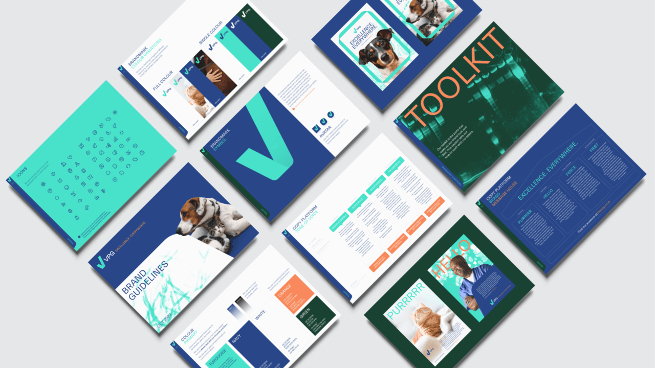
The final brand identity uses both visual and verbal elements to create a distinctive brand that clearly communicates VPG’s unique culture and independent approach, but is firmly rooted in the category and able to effectively challenge much larger competitors.
Ben Mott
Founder & Managing Director, FutureKings
Positioning Crest Experiances as experts in active leisure destinations and supporting their inland surfpark vision.
Brand identity Brand strategy Design Guidelines

A complete brand refresh, from logo to packaging & website, with a supporting launch campaign to grow sales and boost brand standout.
Brand identity Brand strategy Campaigns Design Guidelines Packaging UI UX Websites & Apps
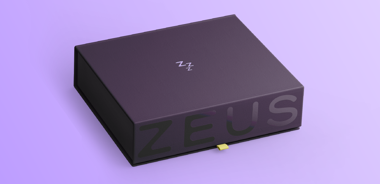
Repositioning and refreshing Zeus as a premium sleep health brand, offering non-invasive solutions for snoring and sleep apnea.
Brand identity Brand strategy Design Guidelines Packaging UX Websites & Apps