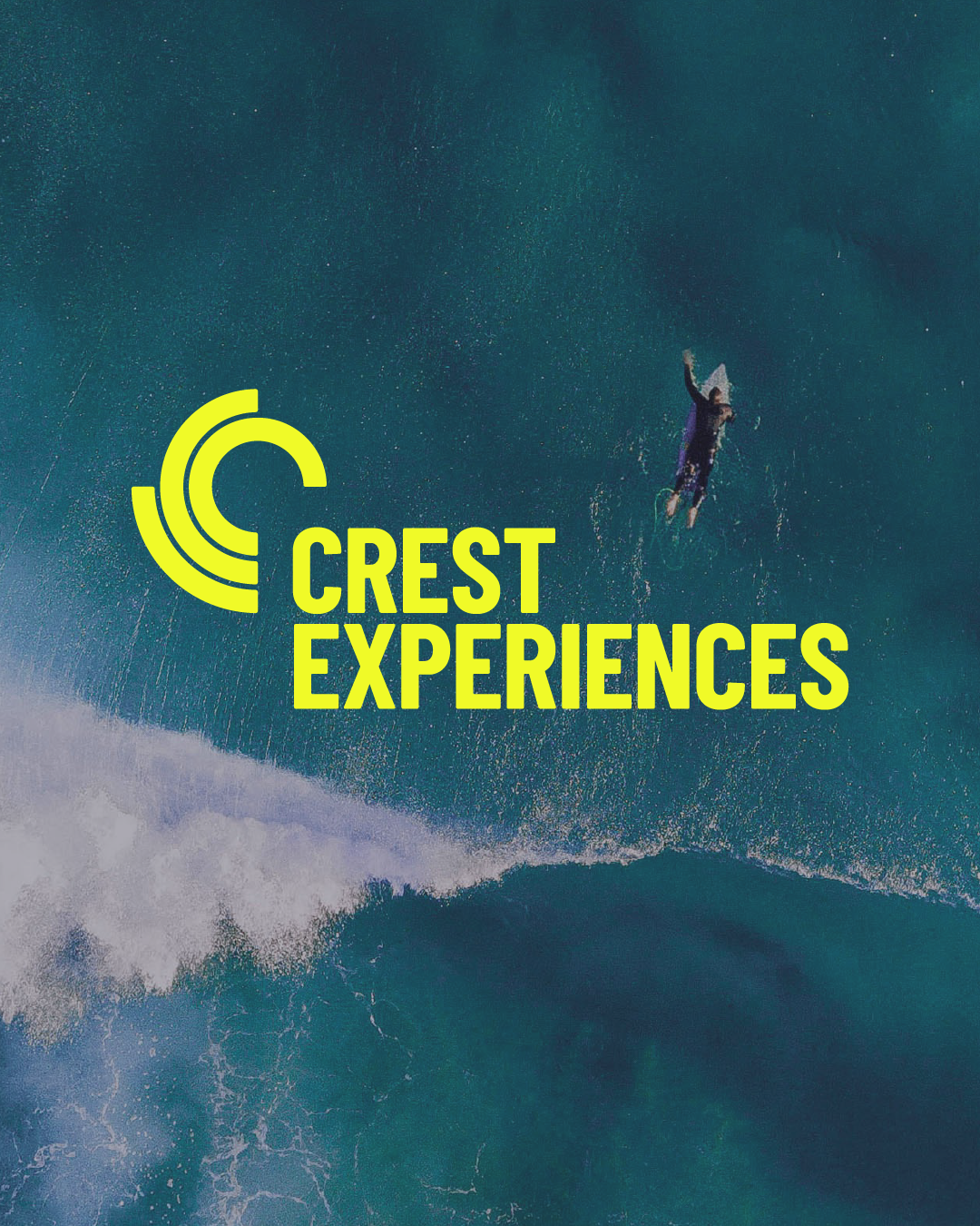
Crest Experiences
Brand identity & strategy for Crest Experiences
Positioning Crest Experiances as experts in active leisure destinations and supporting their inland surfpark vision.
Brand identity Brand strategy Design Guidelines
Big news — we're now in Amsterdam!
Find out more here.Refreshing and repositioning the brand identity to breathe in more character and distinction.
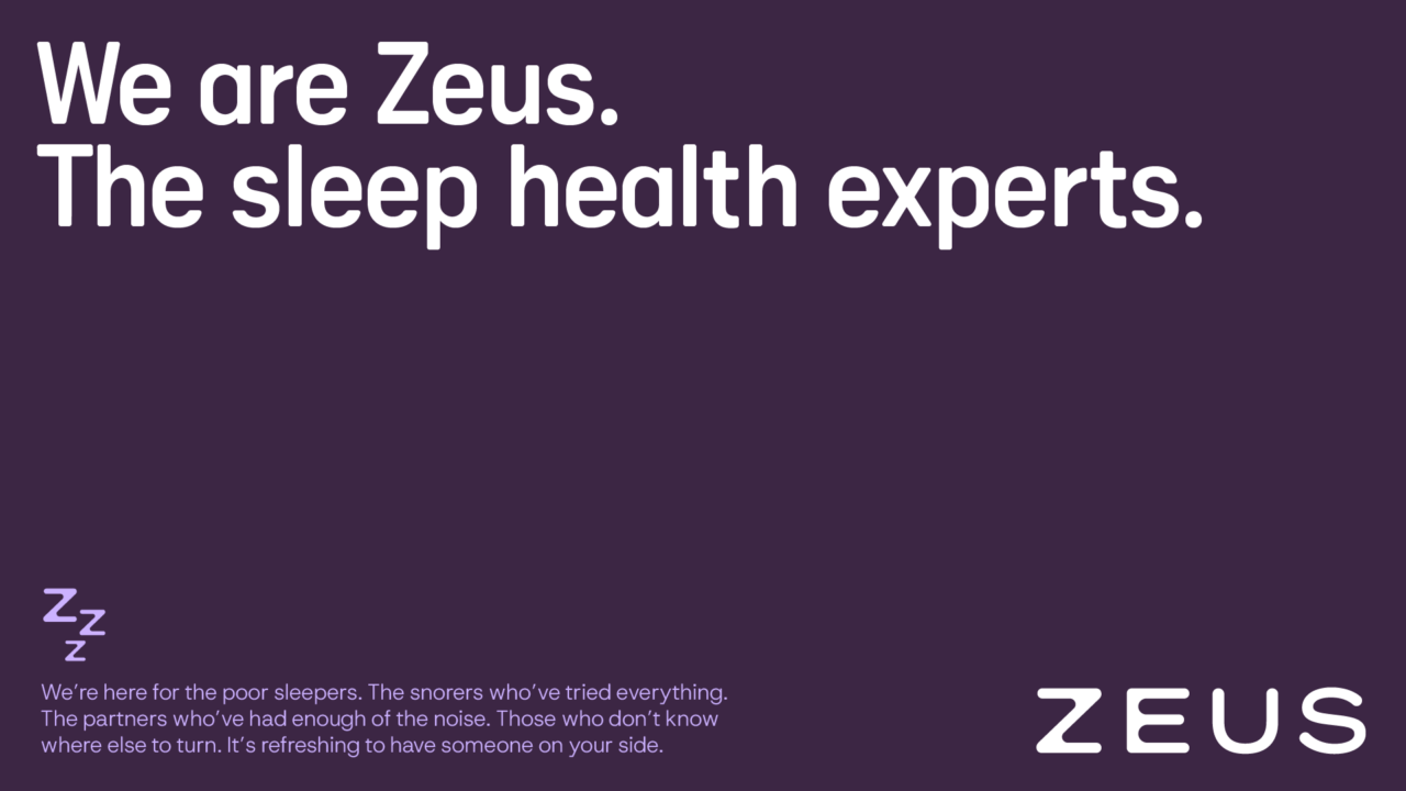
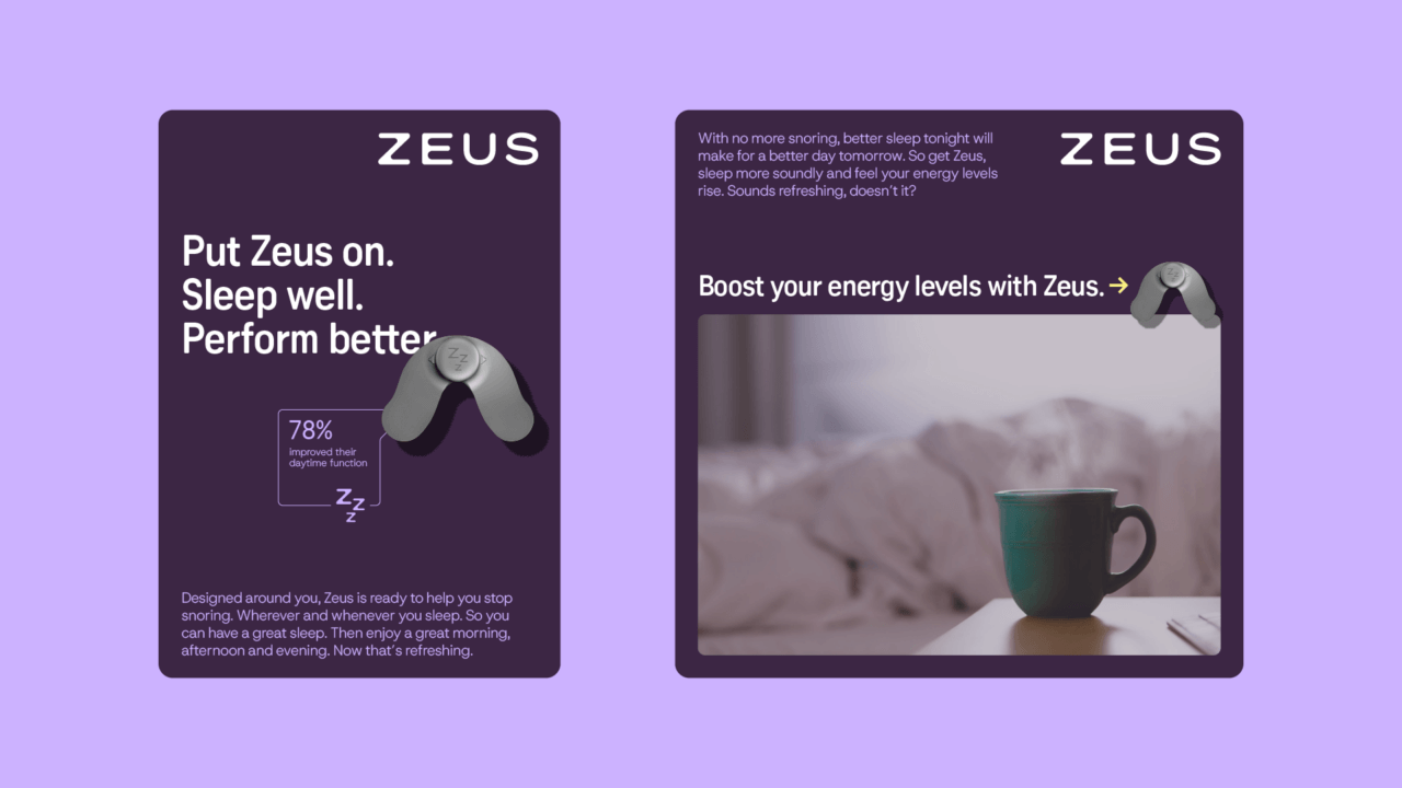
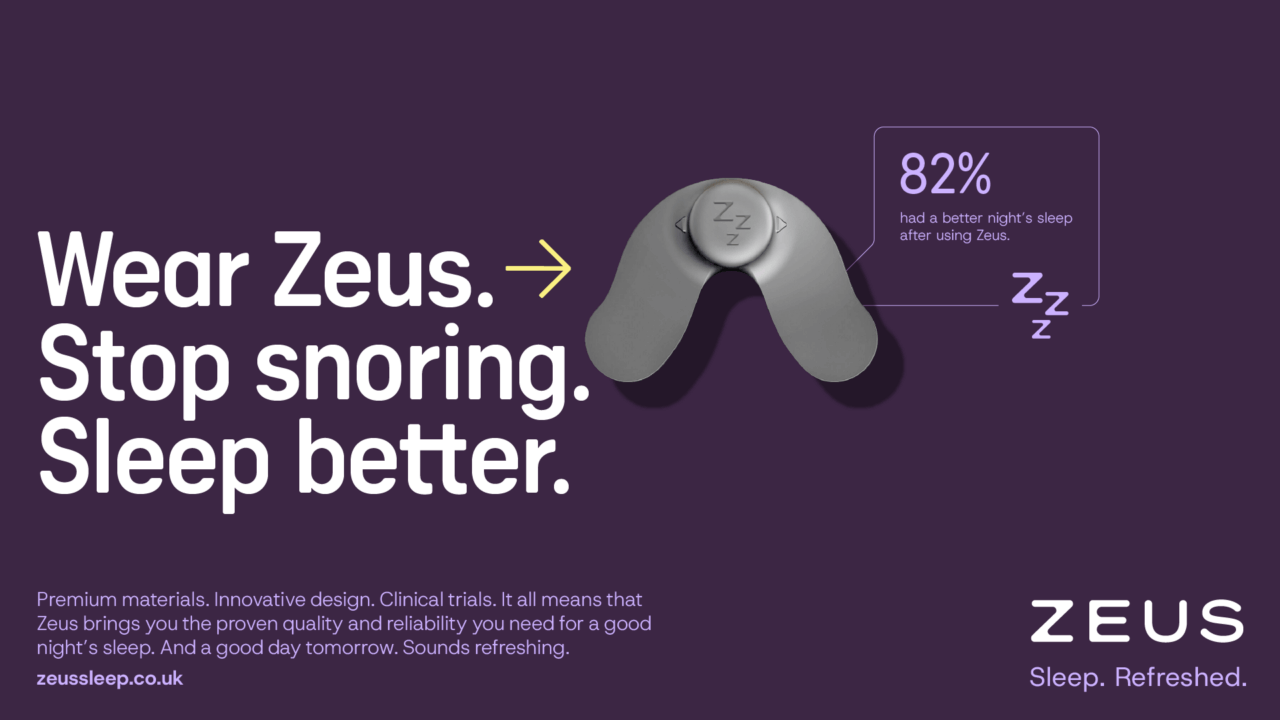
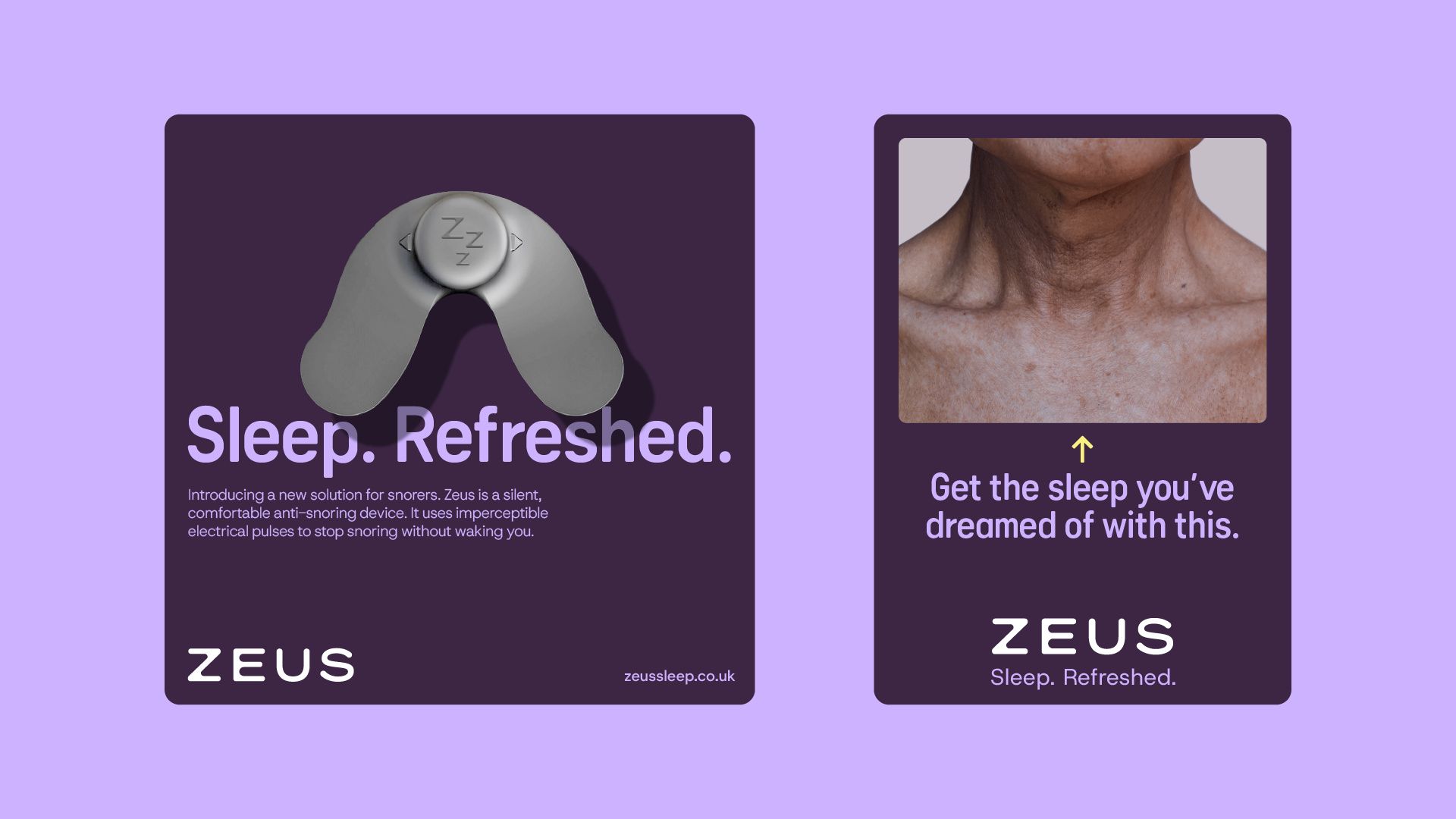
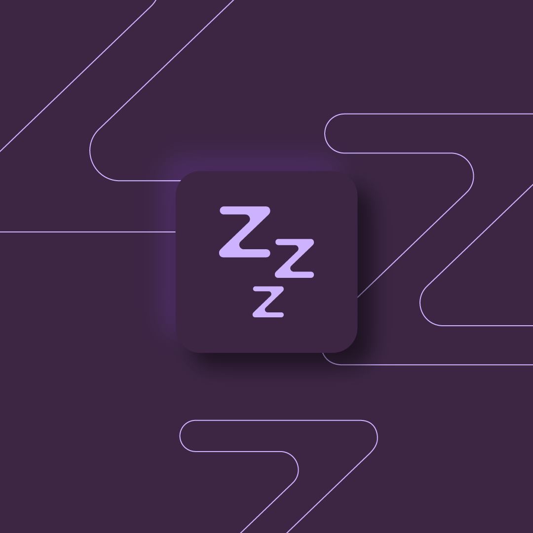
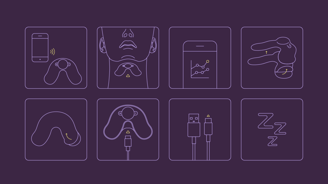
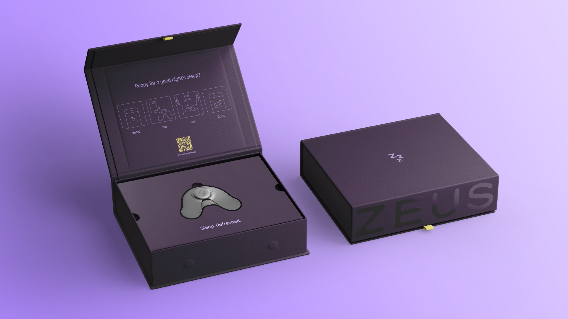
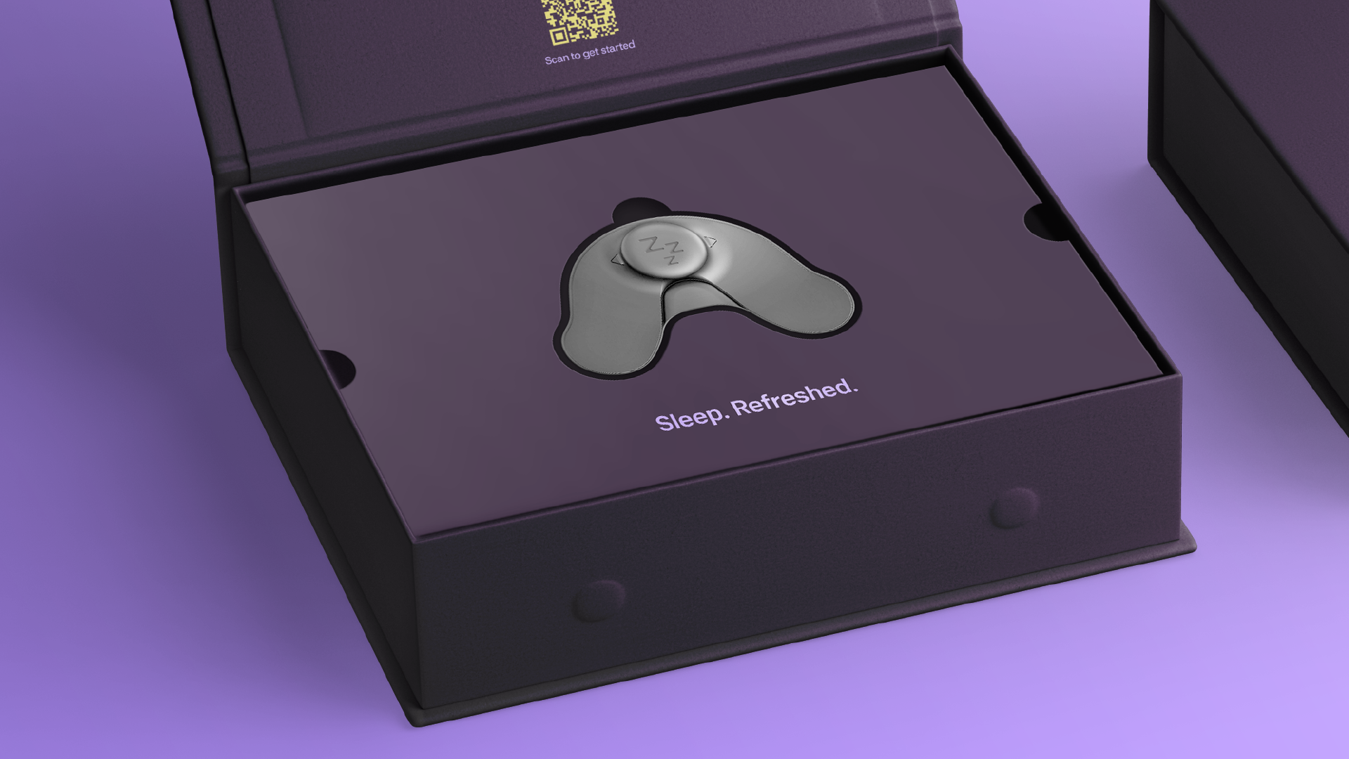
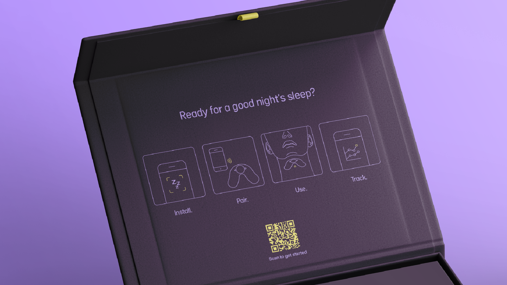
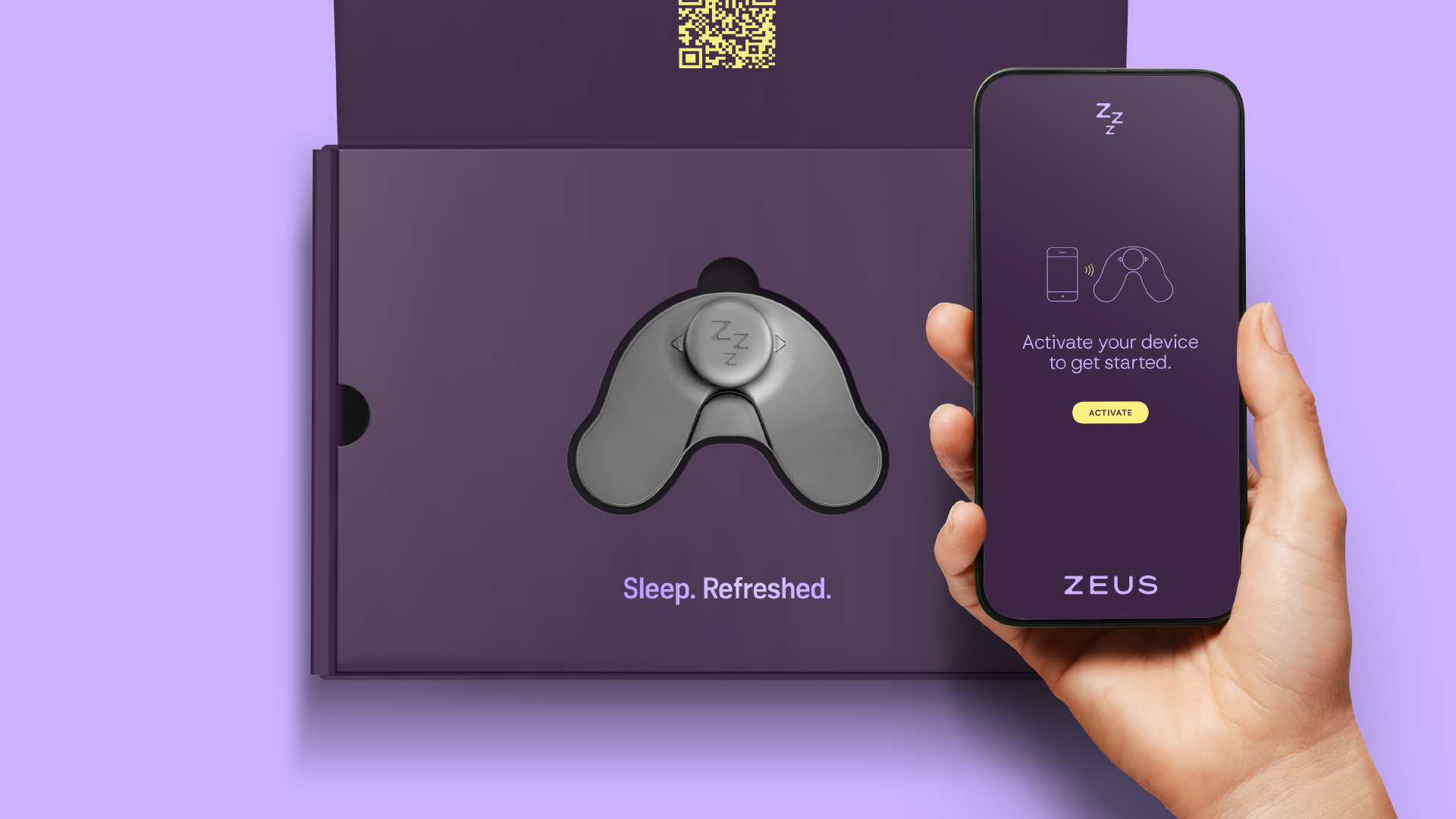
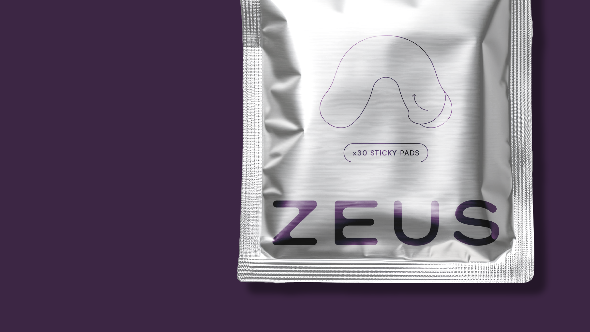
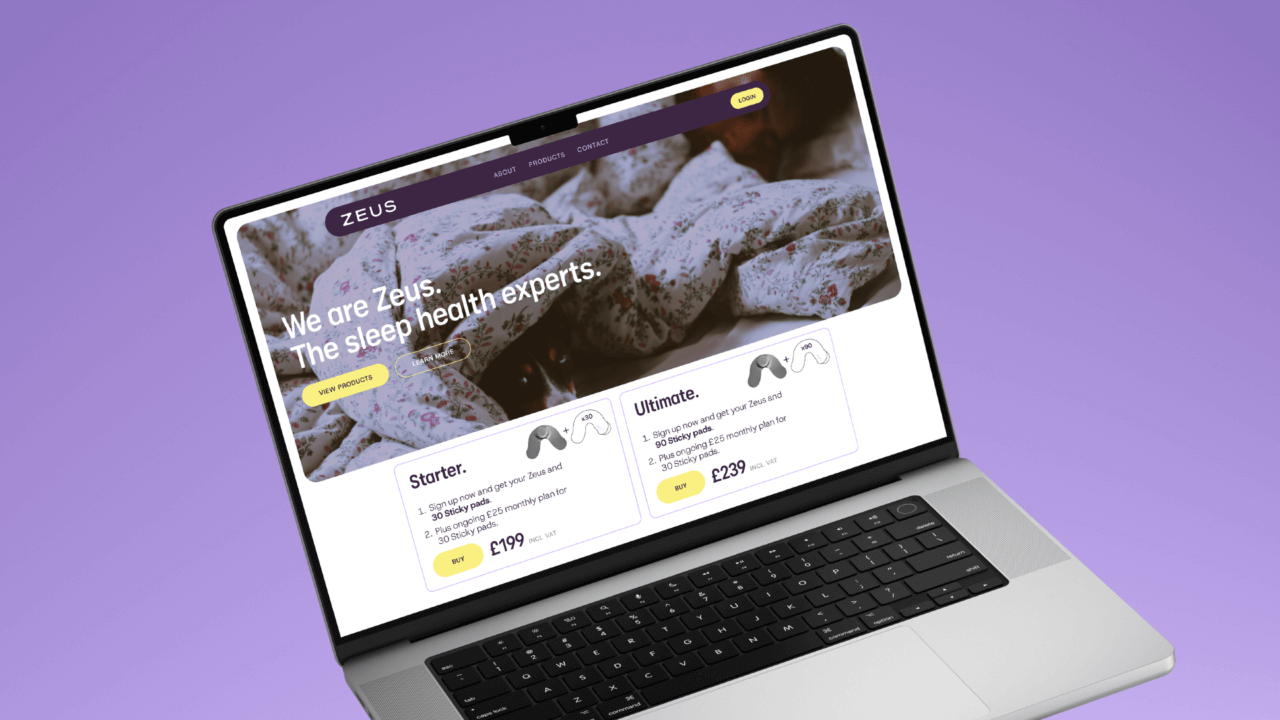
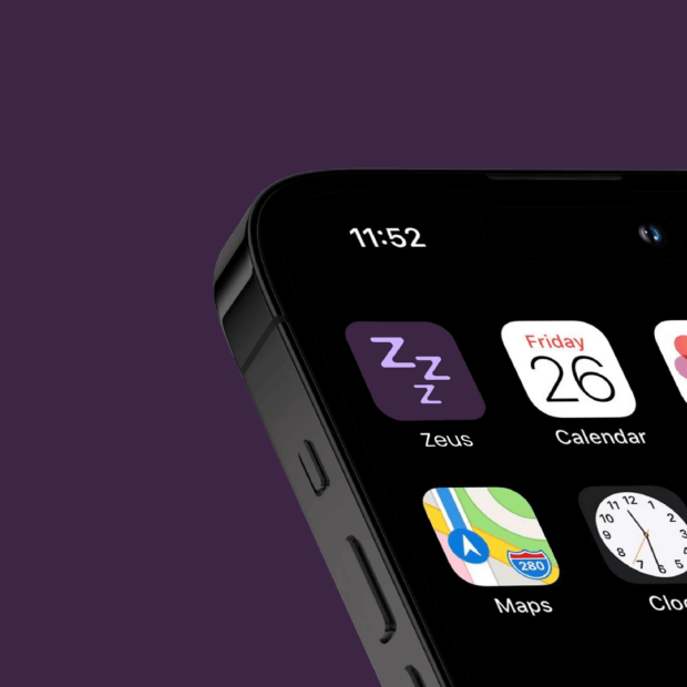
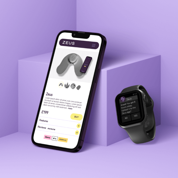
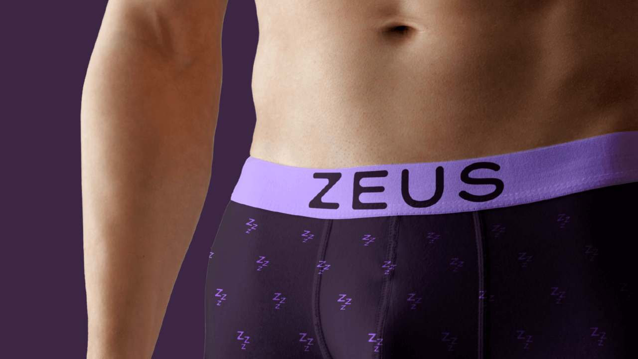
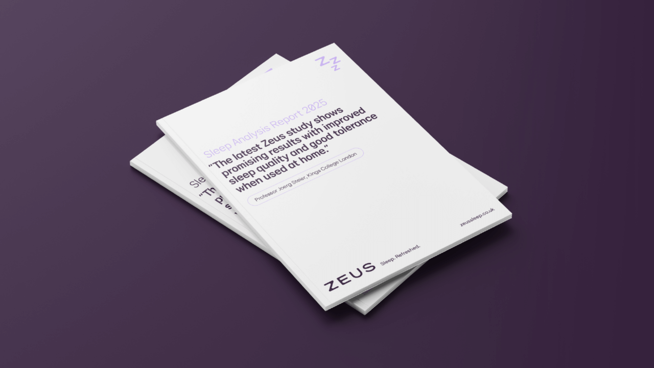
Zeus are the sleep health experts. Founded on over a decade of clinical research and developed in partnership with top NHS institutions, Zeus delivers silent, comfortable, and clinically proven solutions to snoring and Obstructive Sleep Apnoea (OSA). Their flagship product uses gentle electrical pulses to prevent snoring – all while being unobtrusive, portable, and stylish.
£ 1.48 m
NIHR funding secured
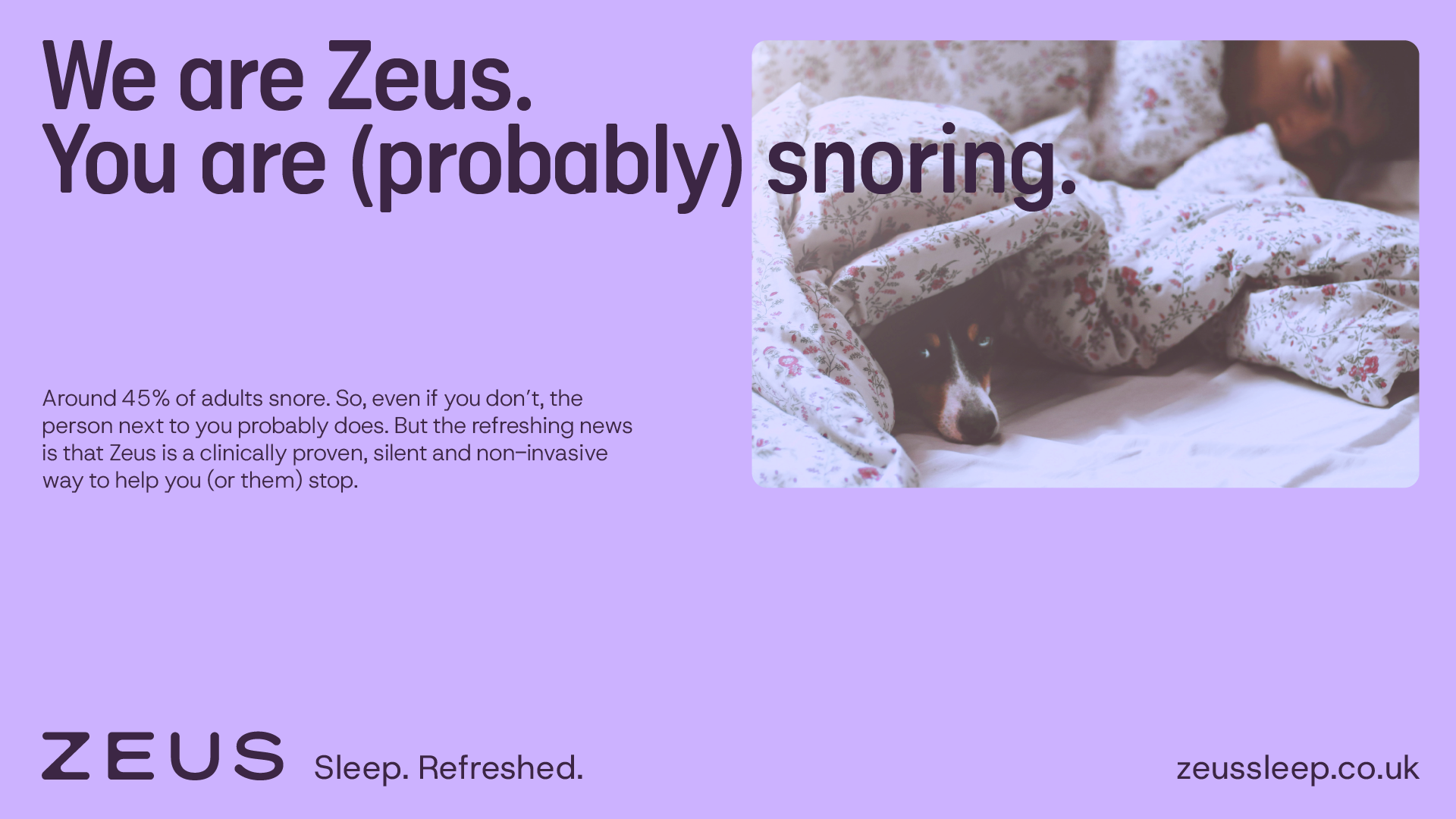
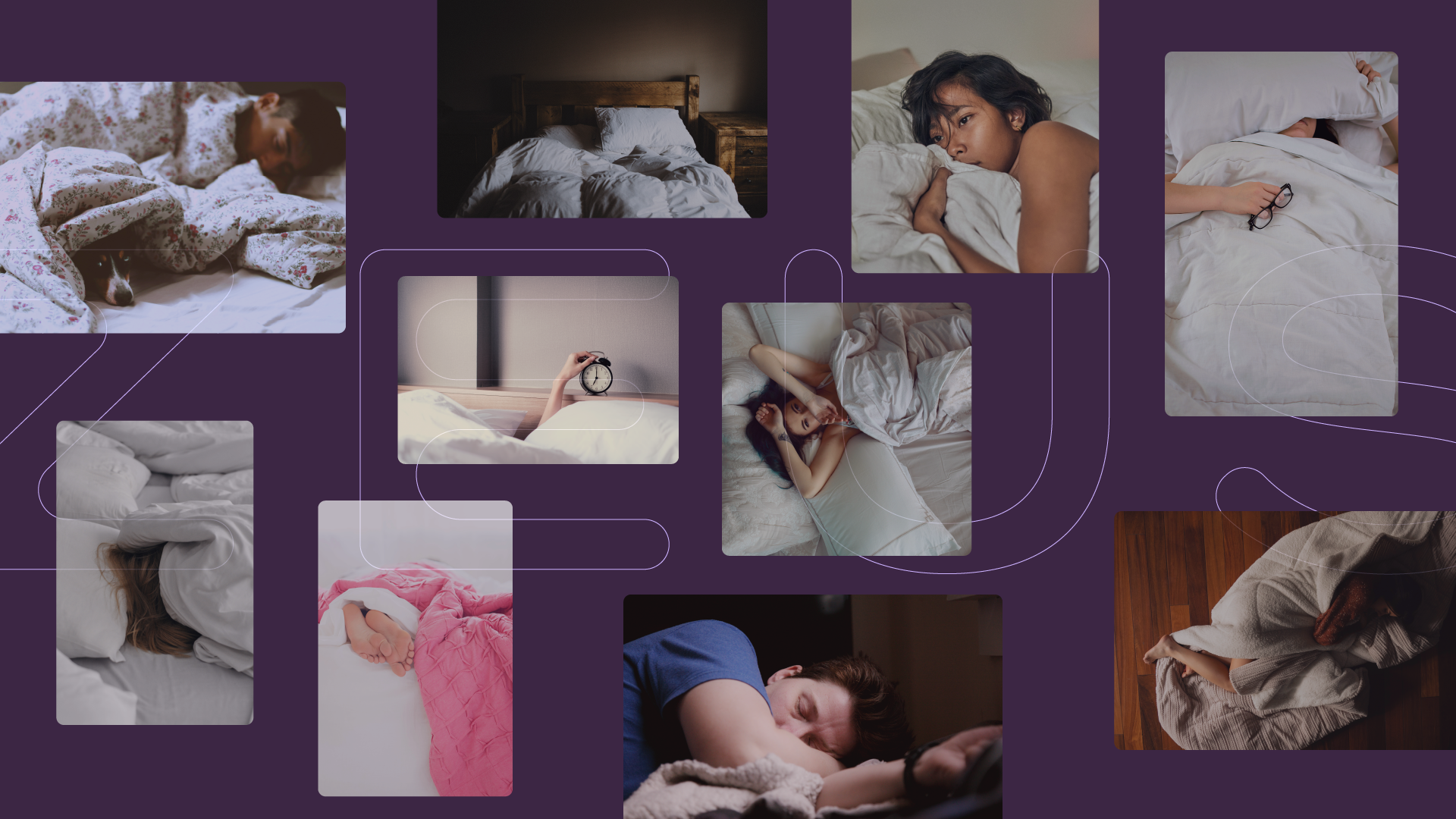
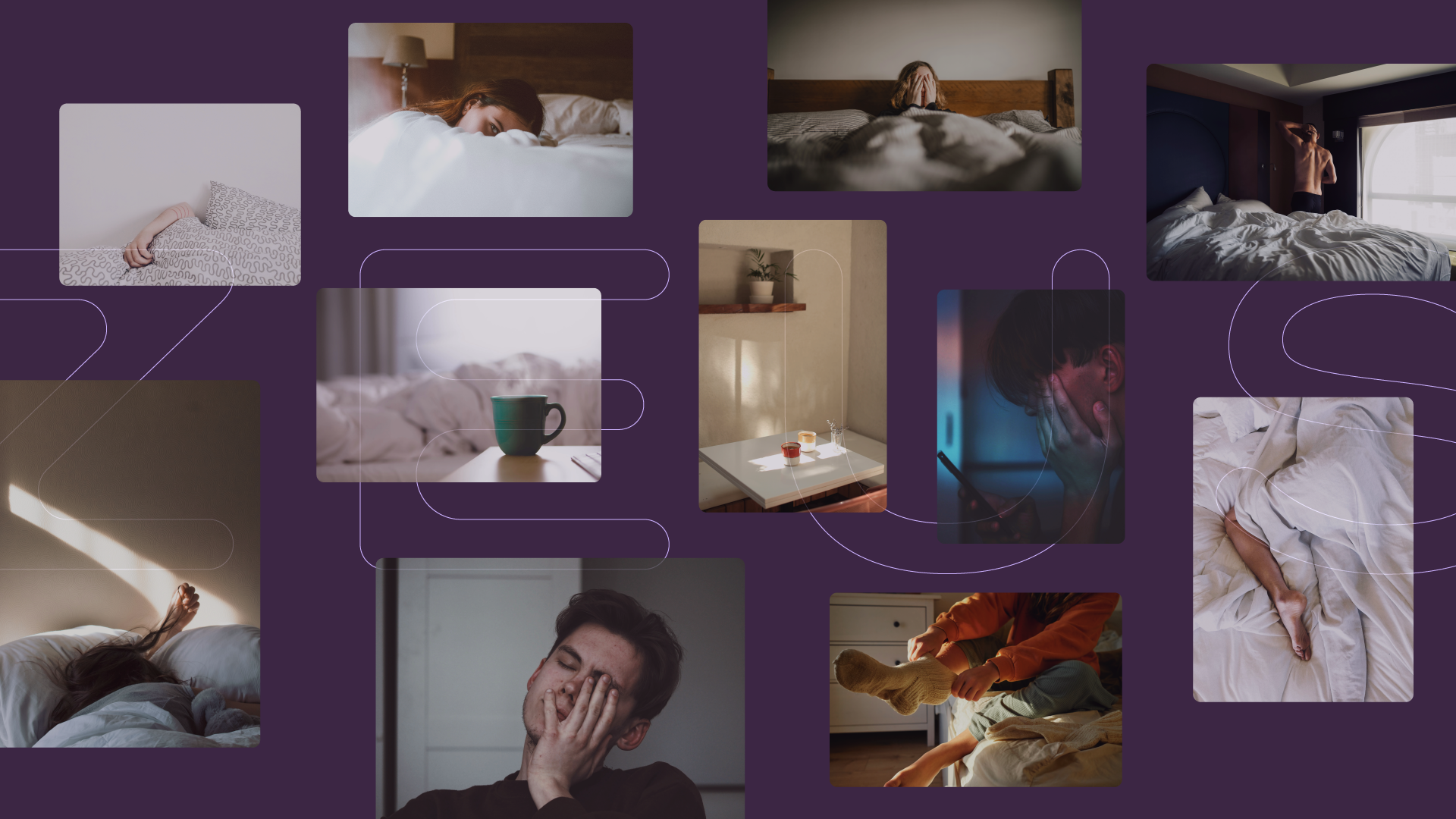
Zeus have a successful and proven product to solve snoring, but are in a complicated category. At one end, there are cheap, unproven products promising a quick and easy solution (though failing to deliver). On the other, there are medical products which are either intrusive or prohibitively expensive.
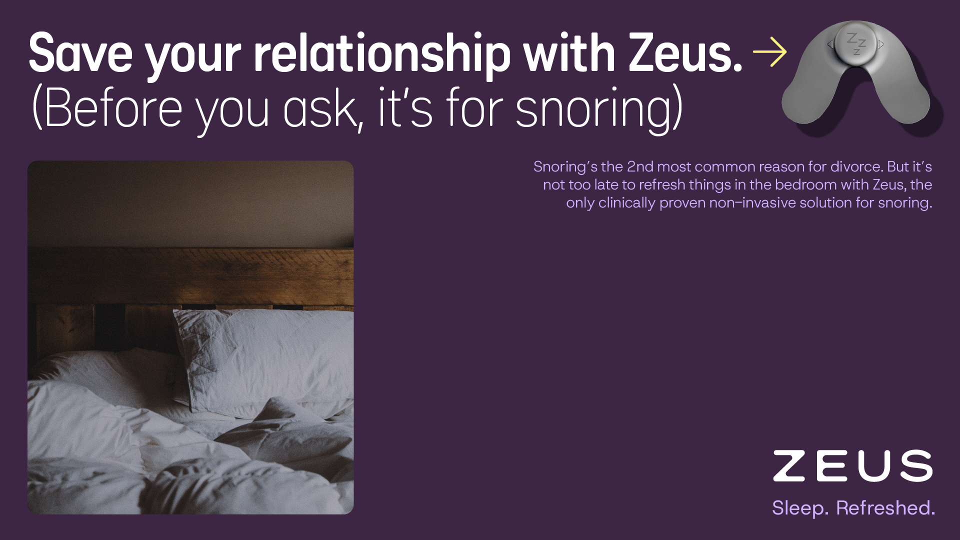
Zeus needed to own its space in the category, positioning itself as the trusted, premium choice for snorers – something that returns clear benefits for the price. We also needed to show that it is non-invasive and fits seamlessly into buyers’ lives, without the compromises of competitors.
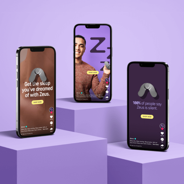
Alongside this, the brand already had a visual identity and set of key messages that required reviewing and sharpening. The brand also needed to work across multiple channels, as sales would be driven primarily through social media.
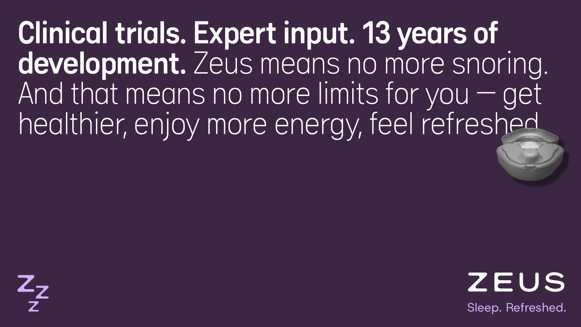
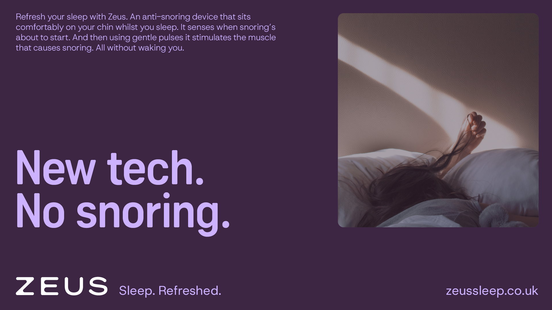

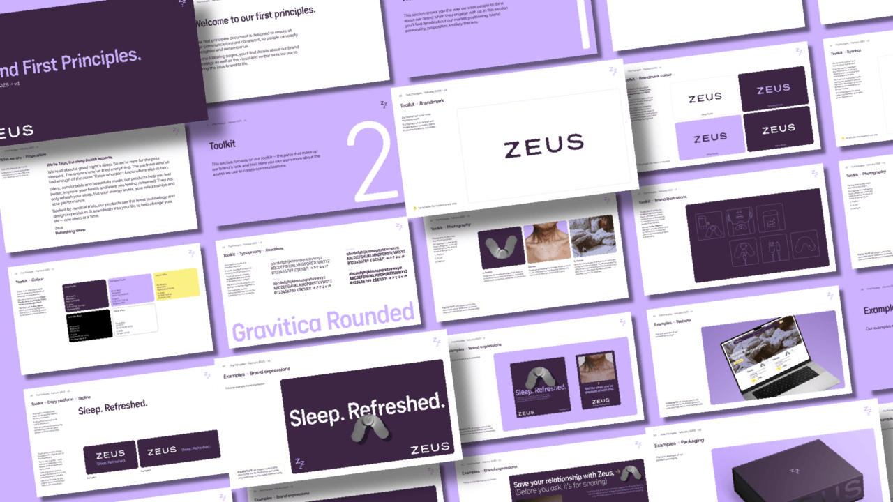
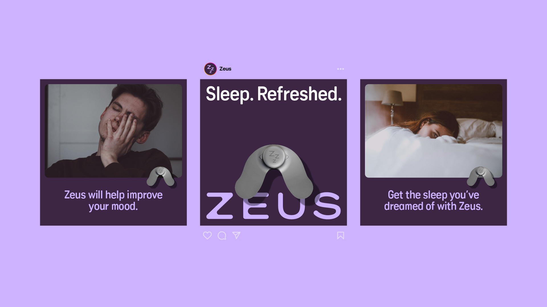
We began by using workshops with the team to review the market, the competitors and the customer segments, as well as focusing on Zeus’ strengths. We shifted the positioning from a niche clinical device to a premium lifestyle health brand. The brand strategy centred on an insight into the feeling a great night’s sleep can bring, which led us to the powerful Organising Idea: Sleep. Refreshed.
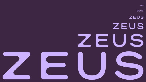
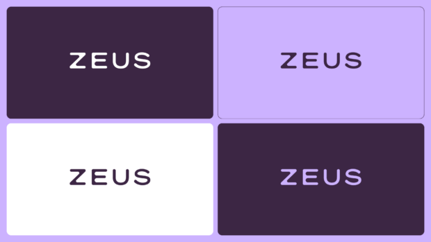
This became our north star for every touchpoint. From there, we built a brand identity that carefully balanced the rigor of science with the convenience (and pleasure) of style. We developed a new visual and verbal system that was as clear, expert and uplifting as the product.
Typography is purposeful and legible, while the copy platform is built to be reassuring, confident and non-judgmental because snoring is such a difficult subject for many people to discuss. A set of brand-level messages communicate the product benefits alongside the credibility behind it. A further set of messages were developed to help the team target specific segments.
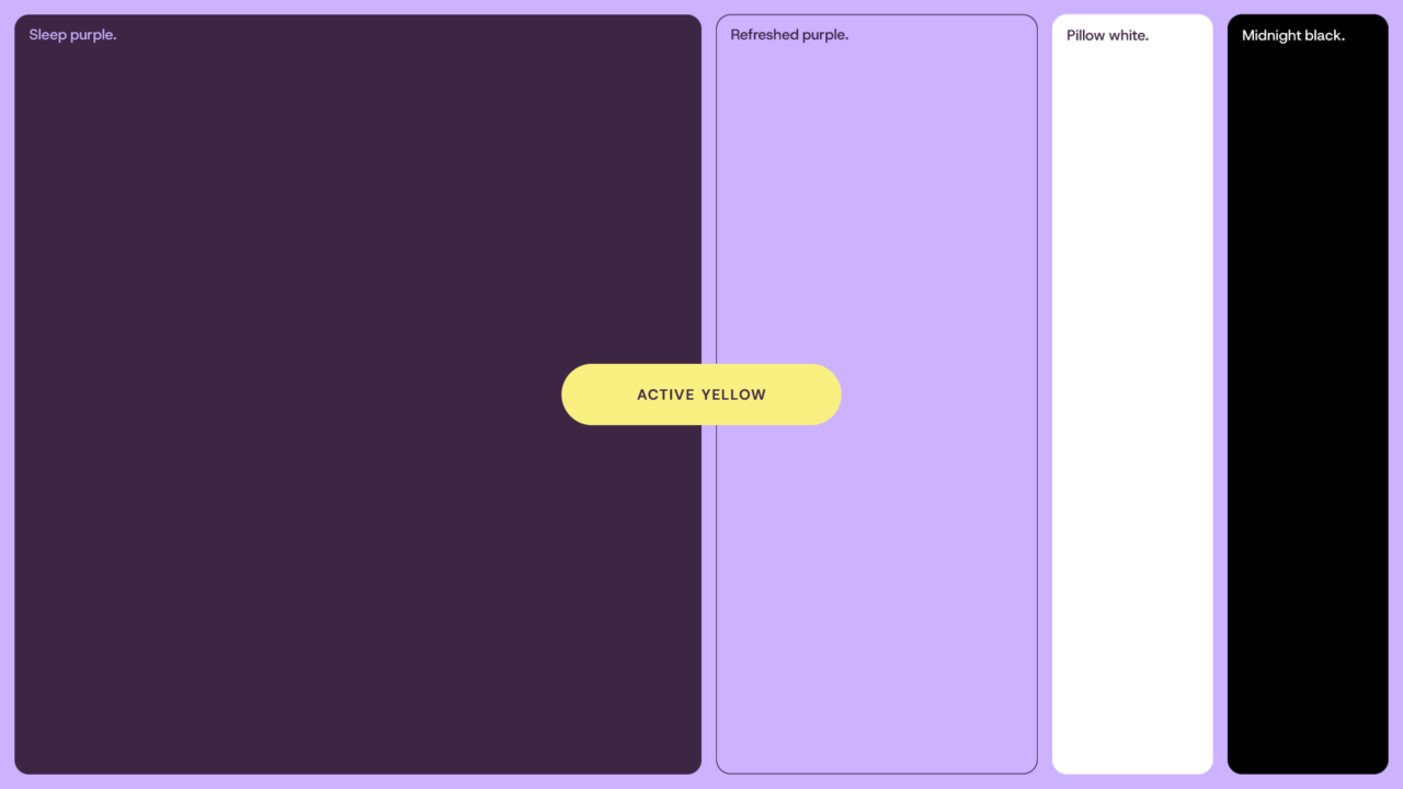
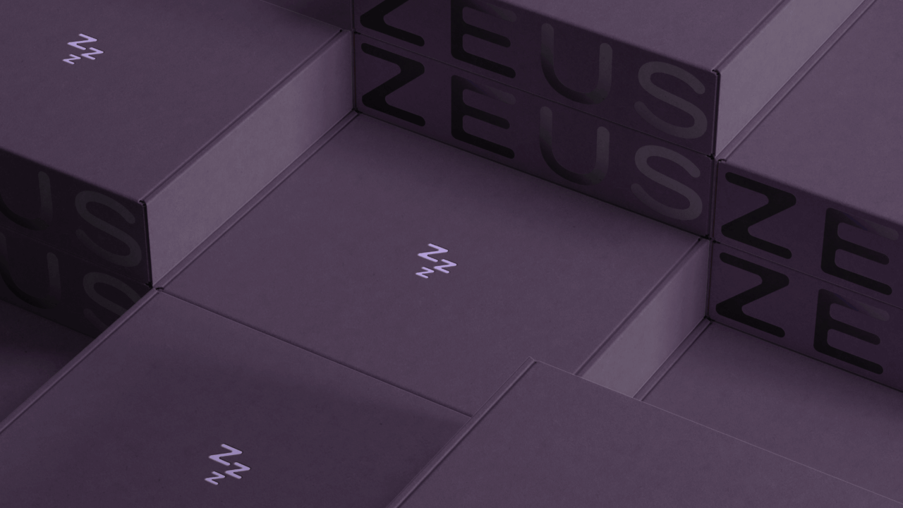
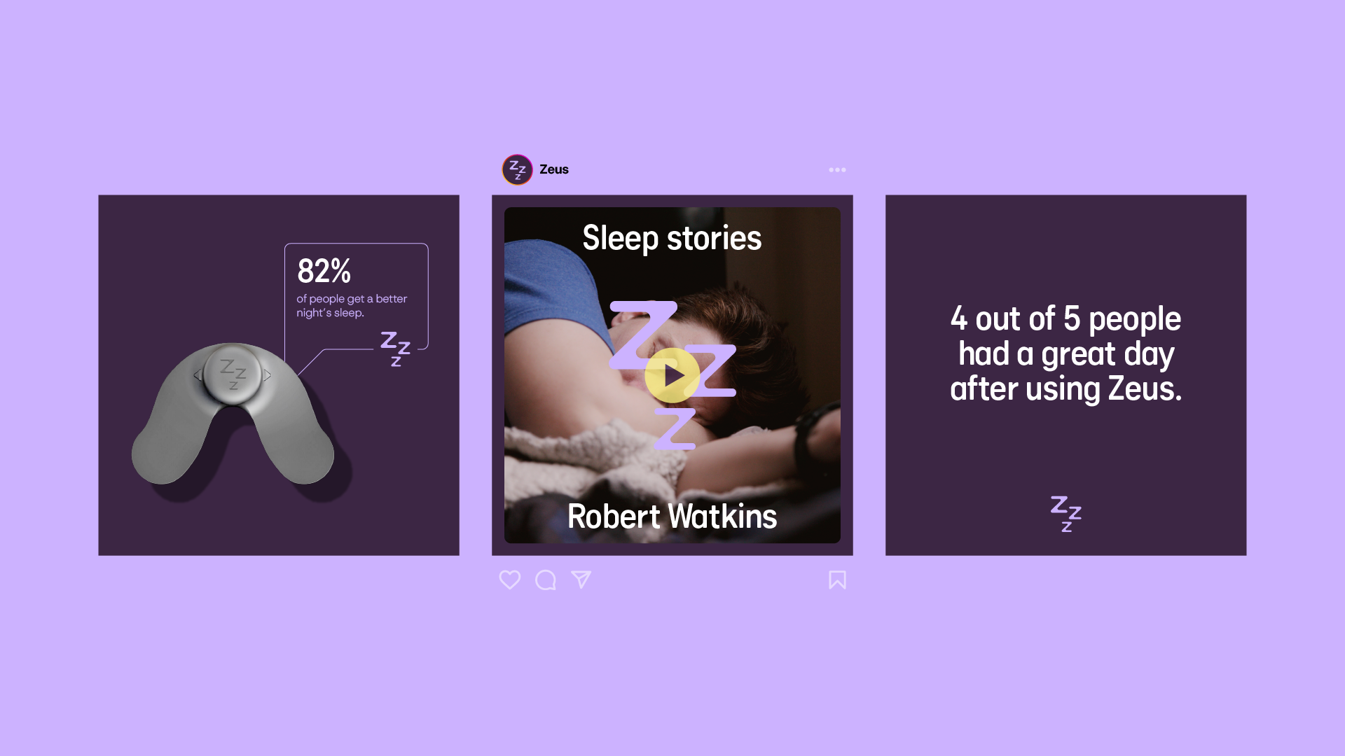
Darker and lighter purples give the colour palette a ‘sleep’ and ‘refreshed’ duality, while an active yellow leads the CTAs to make action clear and simple. Photography leans into lifestyle moments, focusing on the broader benefits of better sleep, not just how the product functions.
Everything is designed to speak directly to those people actively looking for a real fix to a disruptive snoring problem, whether it’s their own or someone sleeping next to them. No scare tactics. No overstatements. Just confidence through real science made refreshingly simple.
“With a product that was so long in development and so rigorously tested and perfected, we knew we had to give the same commitment and care to the brand. Repositioning the brand as a premium product helps to move away from the low-end competitor set, whilst the visual identity and customer journey help to reinforce the quality of the product.”
Jon Kerswell – Strategy Director, FutureKings
Positioning Crest Experiances as experts in active leisure destinations and supporting their inland surfpark vision.
Brand identity Brand strategy Design Guidelines

A complete brand refresh, from logo to packaging & website, with a supporting launch campaign to grow sales and boost brand standout.
Brand identity Brand strategy Campaigns Design Guidelines Packaging UI UX Websites & Apps

Brand identity Brand strategy Design Guidelines Naming Websites & Apps